a tribute to land & legacy
*
a tribute to land & legacy *
TEQUILA 125
Brand Narrative
Brand Identity
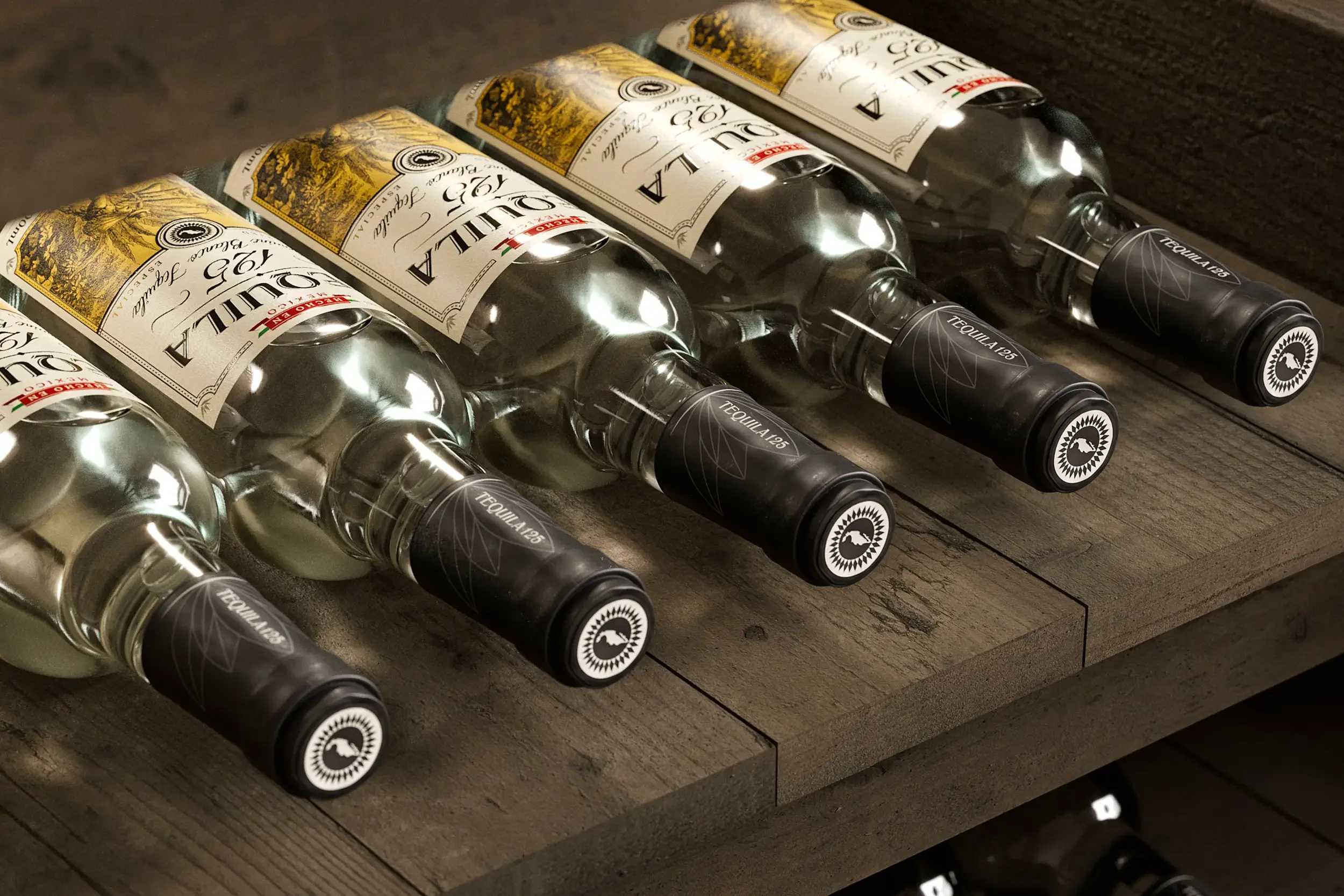
Packaging Design
Illustration
Created at Our Revolution
How It Started.
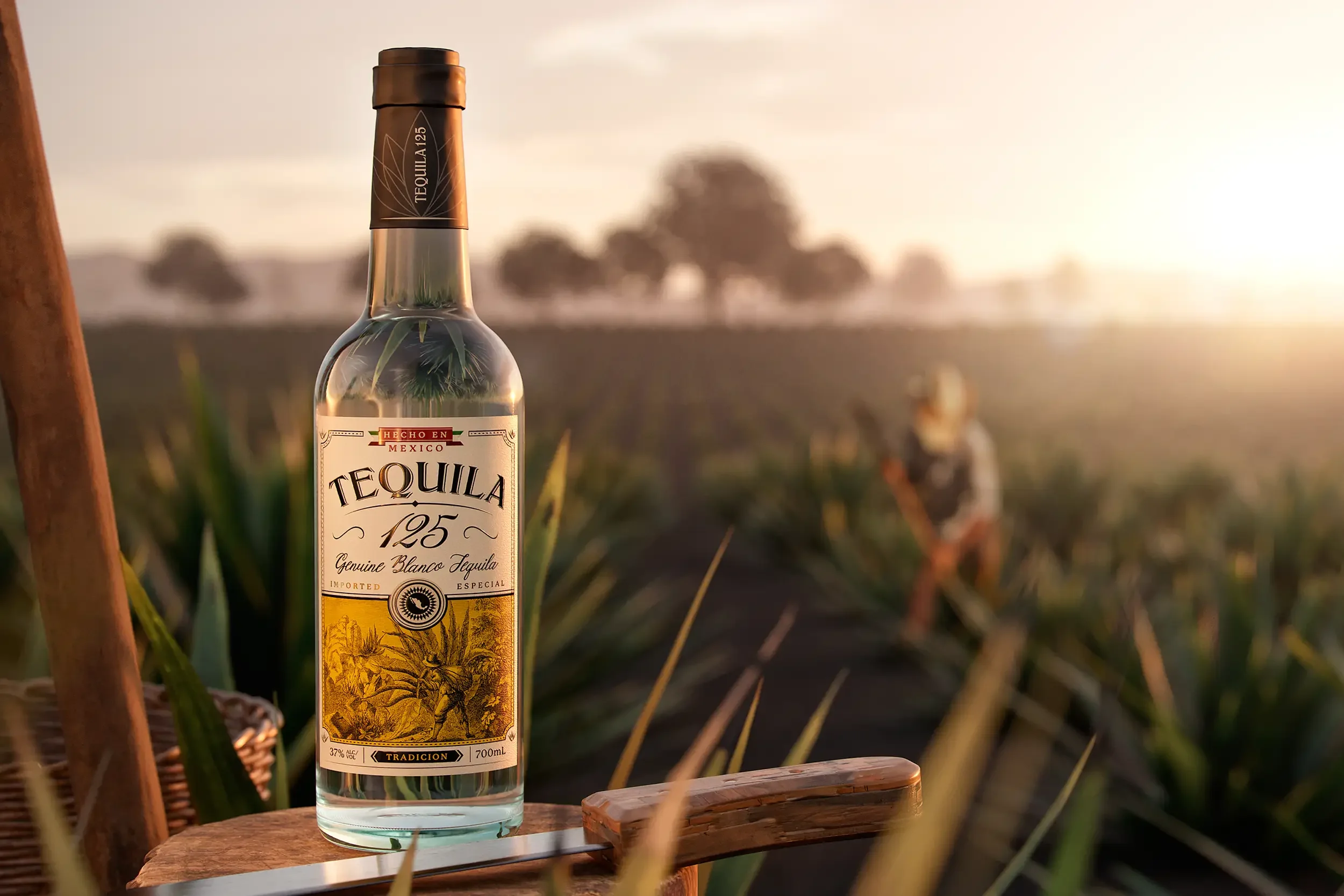
Tequila 125 takes its name from the storied Mexican highway that leads straight to the town of Tequila — a region synonymous with generations of agave growers and the time-honoured craft of distillation.
Along this road, heritage runs deep. Fields are still harvested by hand, and traditional production methods are preserved by families who have lived the craft for centuries.
The challenge was to reposition Tequila 125 as a premium player — one that honours this rich lineage while standing out in a crowded global spirits market. We needed to create a brand that felt authentic and grounded, yet confident and contemporary in its expression of Mexican heritage.
What We Did About It.
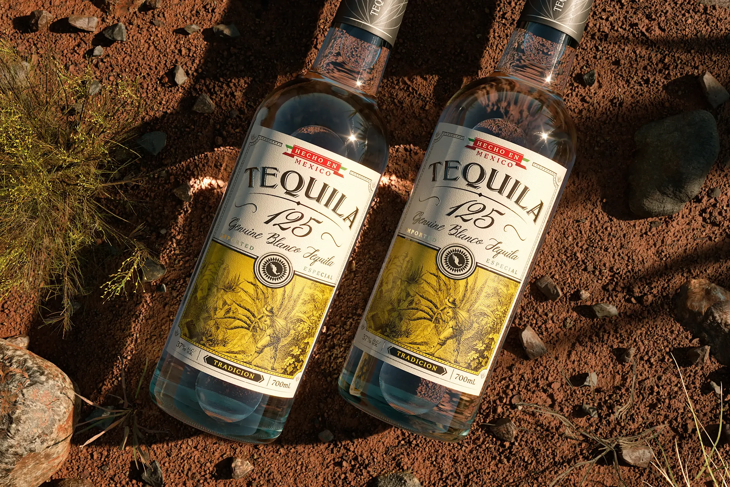
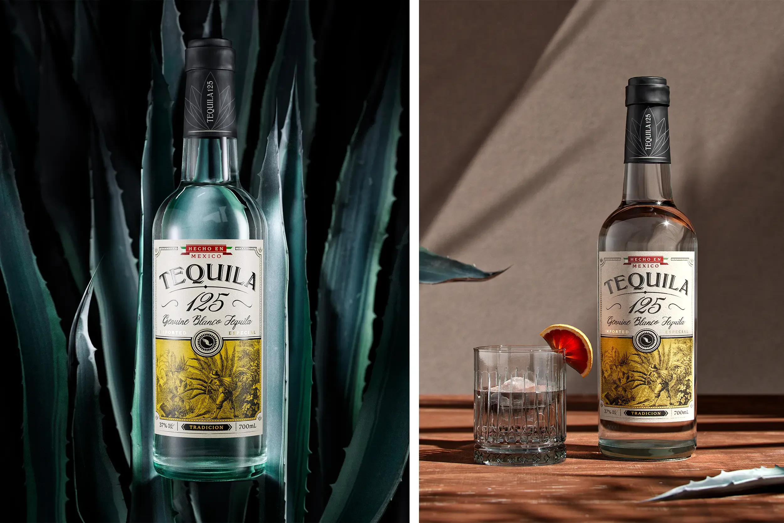
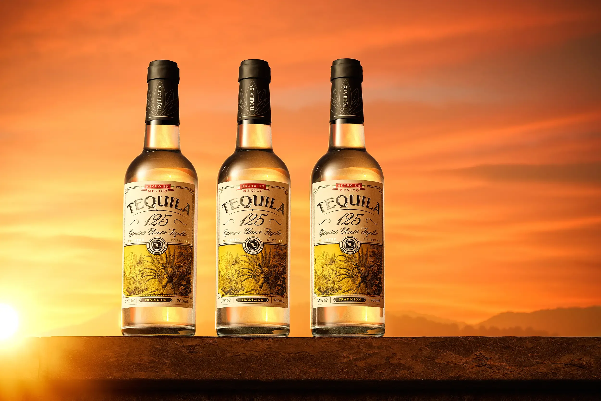
The rebrand centres around a single powerful image: a lone agave farmer, mid-harvest, etched into the label with timeless precision. Surrounding him, the expansive agave fields create a sense of scale, place, and pride. A vivid wash of golden yellow cuts through the detail — adding shelf standout and a sun-drenched warmth that mirrors the spirit’s origin.
Typography was reimagined to amplify impact, with a bold brand marque that asserts presence, balanced by elegant supporting lettering to communicate refinement. Intricate linework and ornamental details are woven throughout, echoing the textures of Mexican craftsmanship and paying homage to the cultural richness of the region.
The result is a tequila that tells a real story — of land, labour, and lineage — through every element of its design. Tequila 125 now stands as a tribute to those who continue to shape one of the world’s most revered spirits.