wellness with a wink
*
wellness with a wink *
THAT HIPPIE CO.
Brand Strategy
Verbal Identity
Brand Messaging
Packaging Design
Campaign
Created at Our Revolution
How It Started.
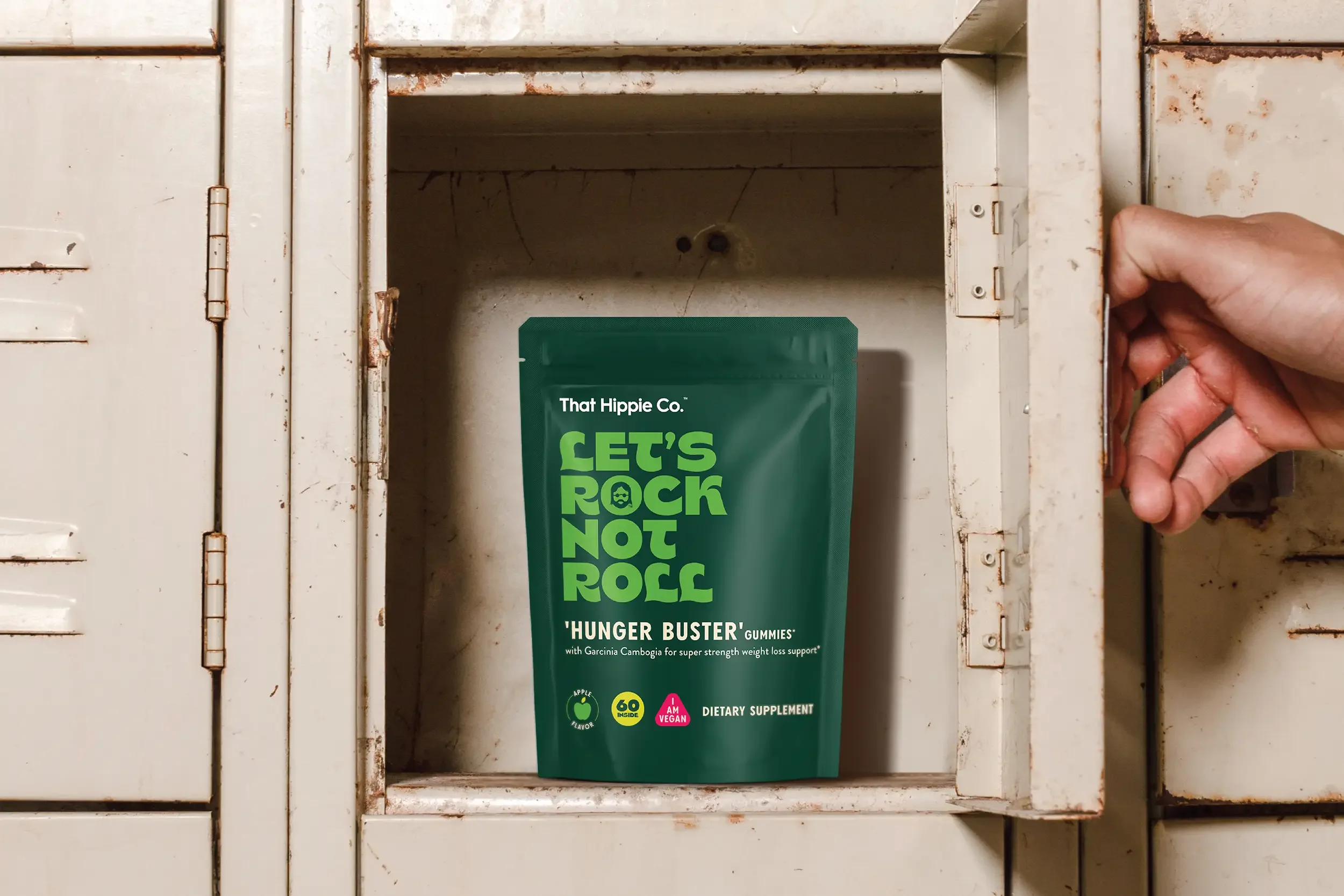
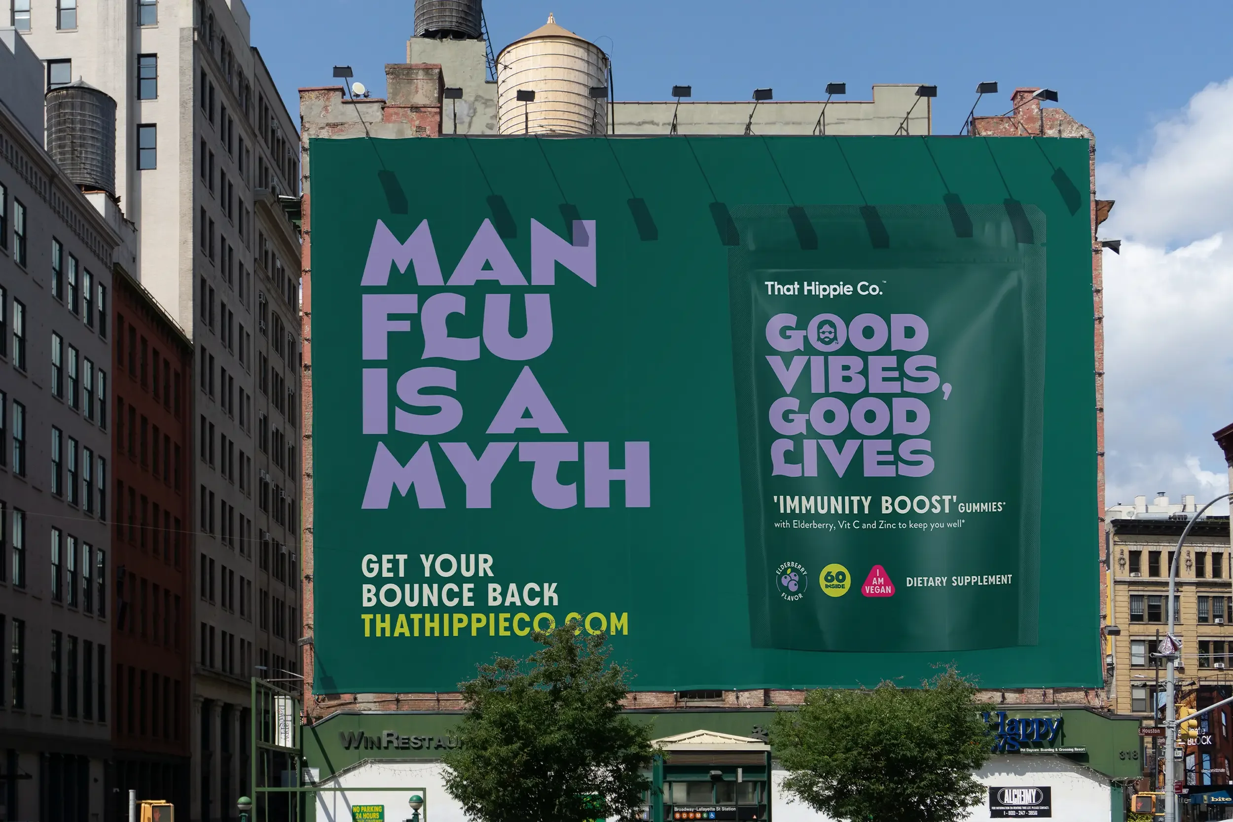
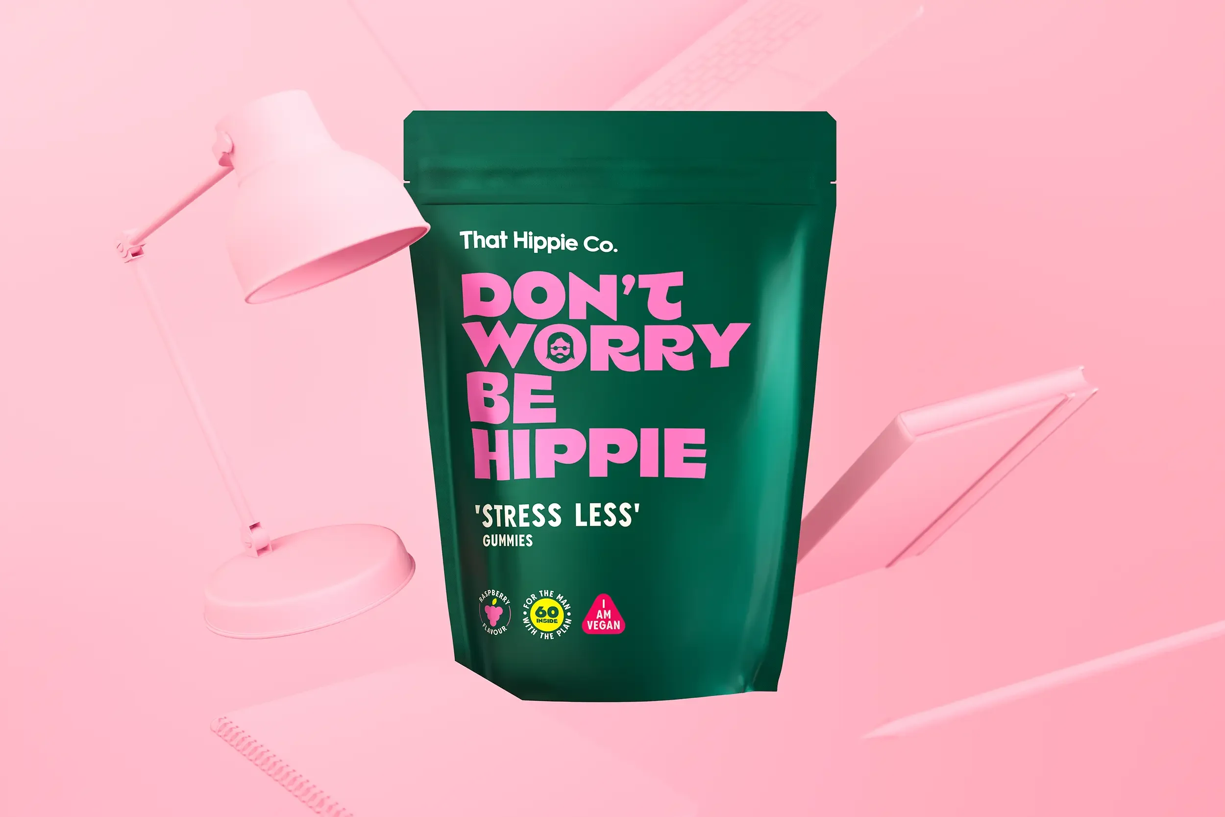
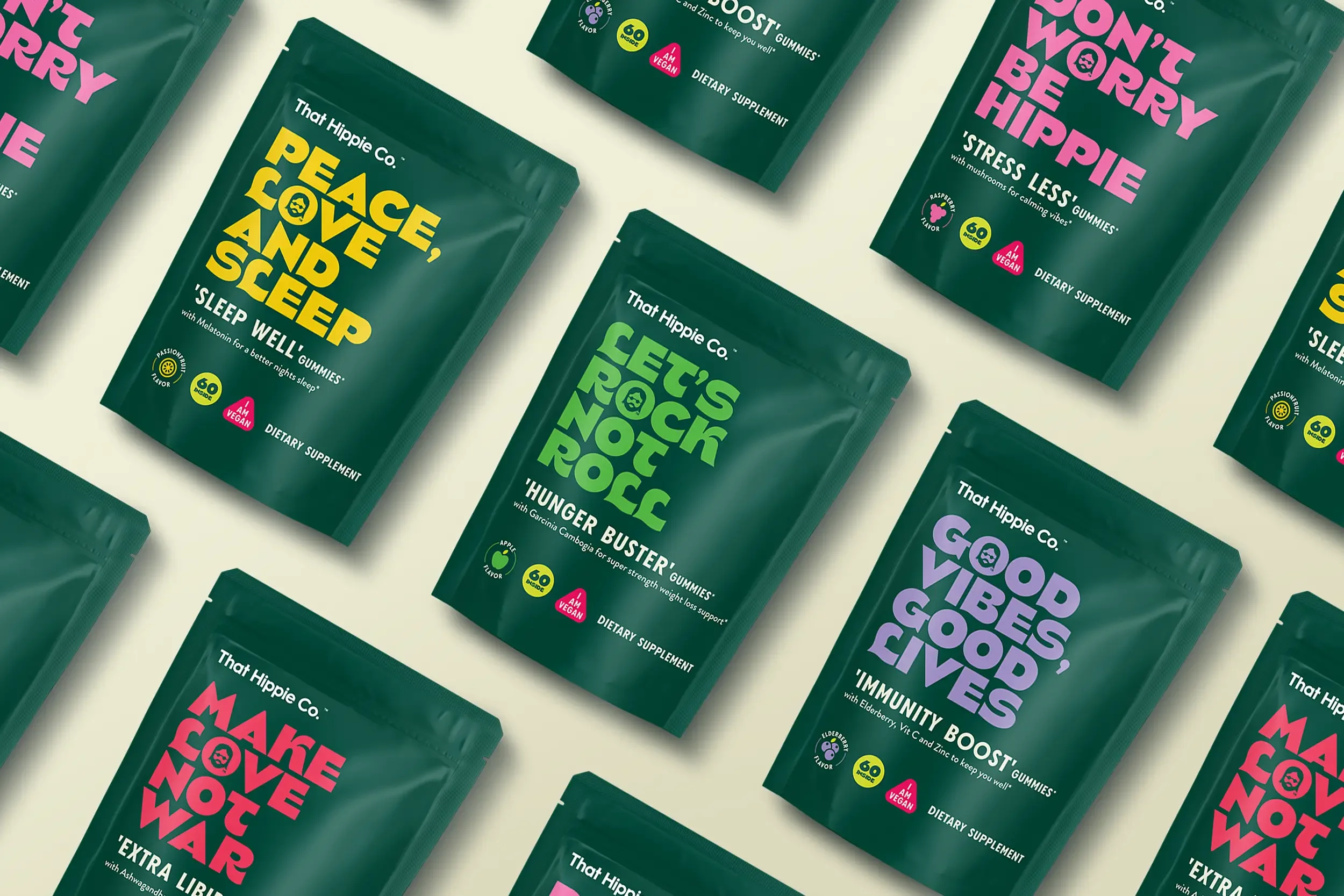
That Hippie Co.’s new range of wellness gummies for men was launching into the crowded and often uncomfortable U.S. supplements market — a space packed with jargon, stigma, and condescension. Designed to support everything from stress, sleep and weight management to hair loss and sexual health, the range targeted an audience that frequently feels overlooked or patronised by health and wellness brands.
Our task was to help That Hippie Co. stand out by doing something surprisingly rare in the category: speak with honesty, humanity, and humour. The goal? Make self-care feel more accessible and less awkward — without ever losing credibility or empathy.
What We Did About It.
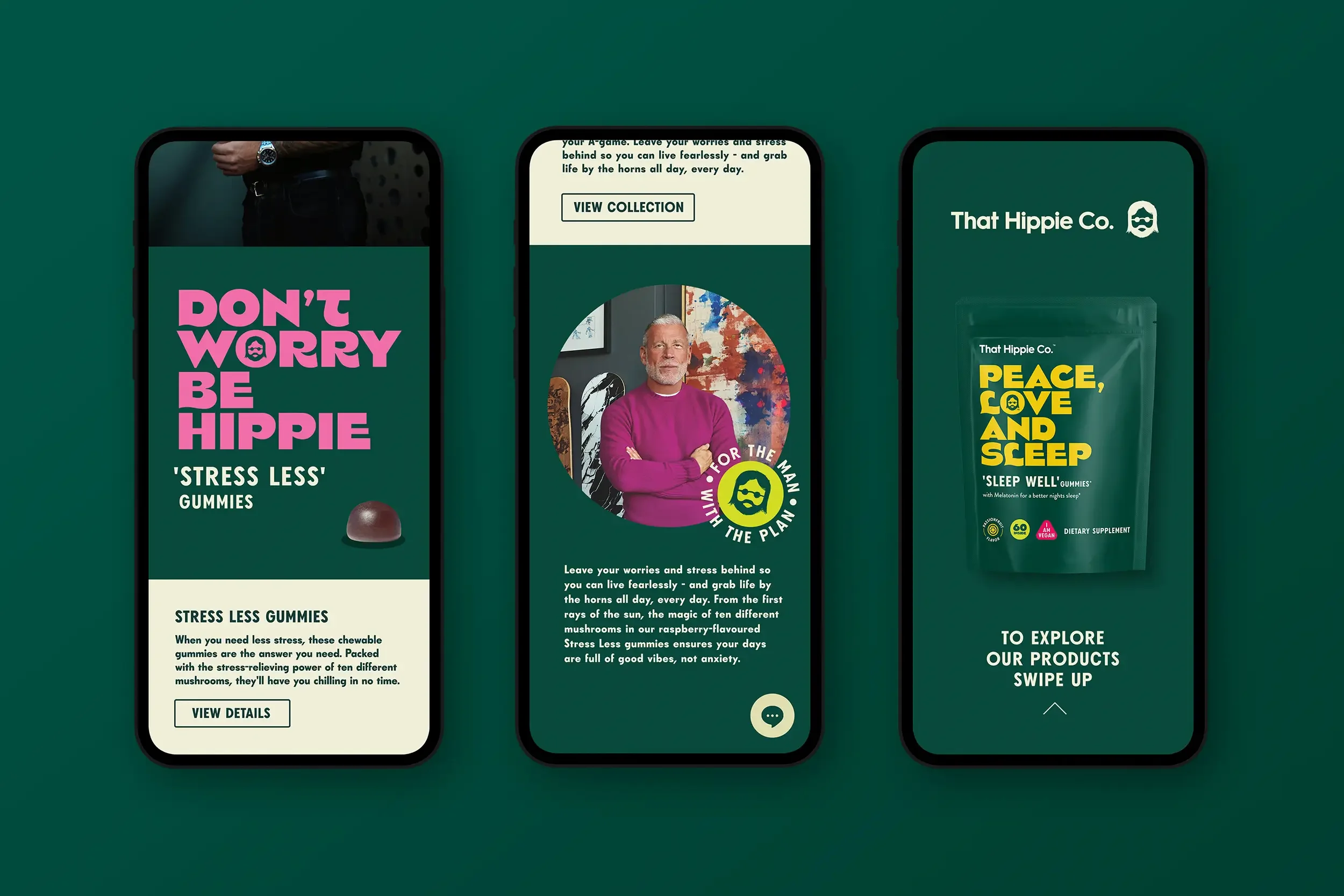
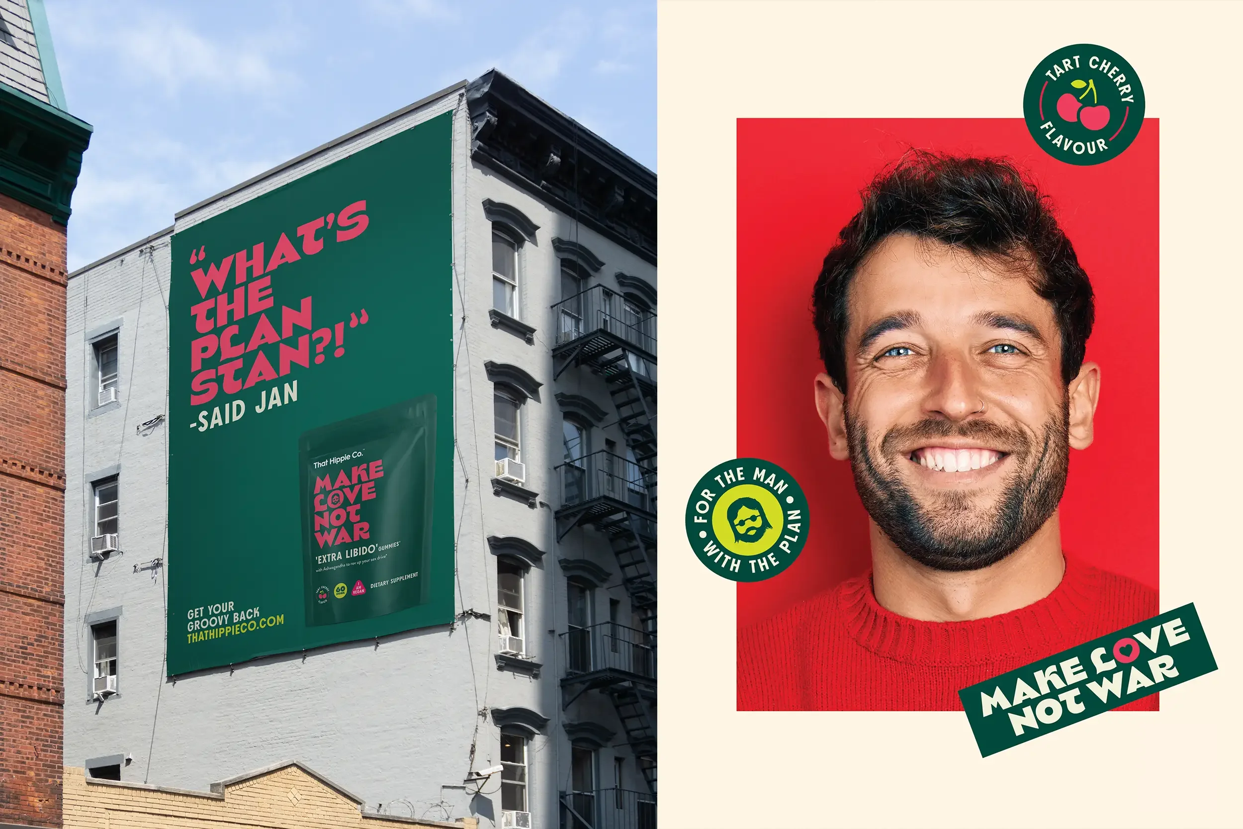
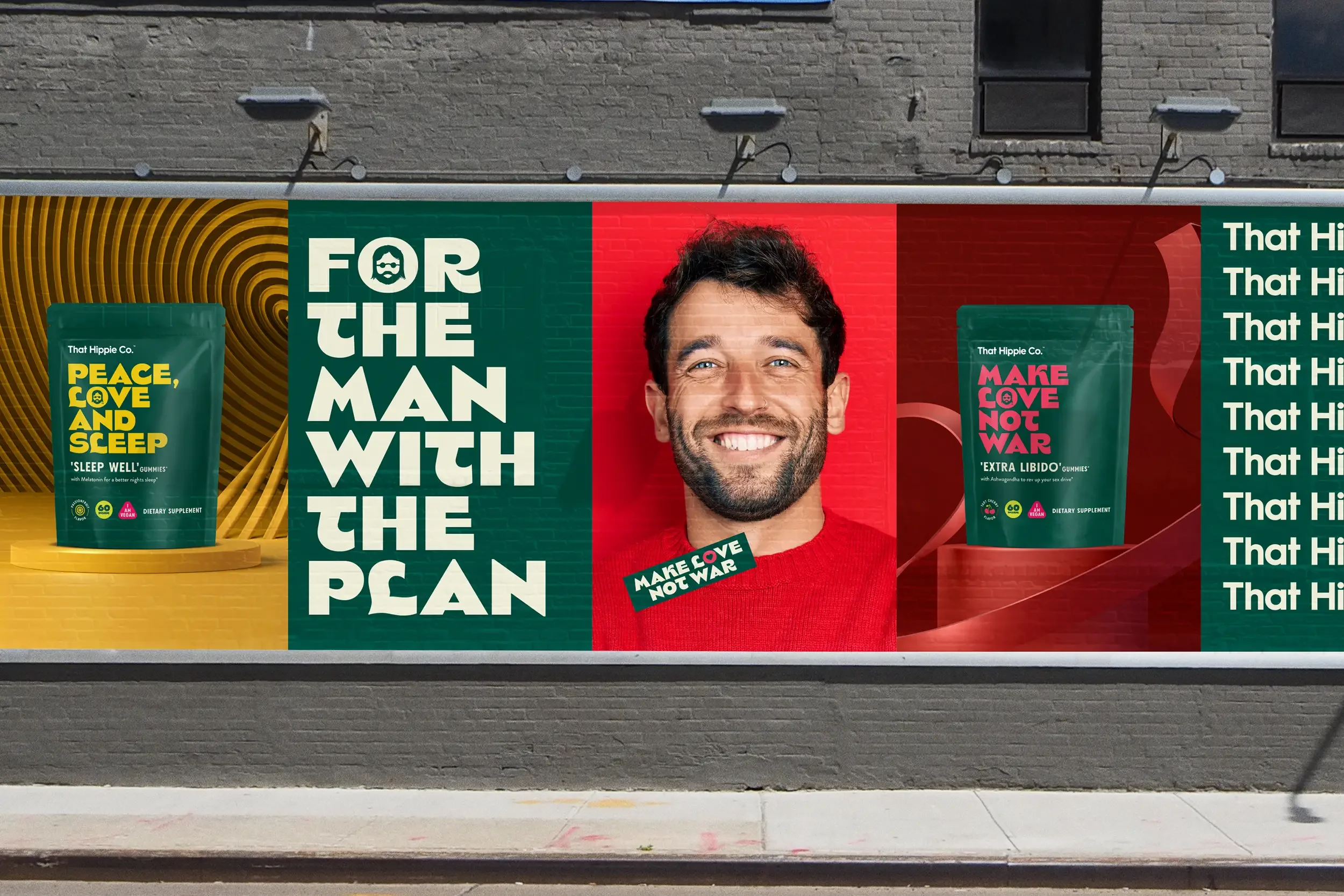
We built a brand world grounded in clarity, comfort, and levity — embracing That Hippie Co.’s free-spirited name while giving it sharper intent and broader appeal. A relaxed, straightforward tone of voice replaced the usual clinical or macho wellness language, opening up a space where men could feel seen and supported.
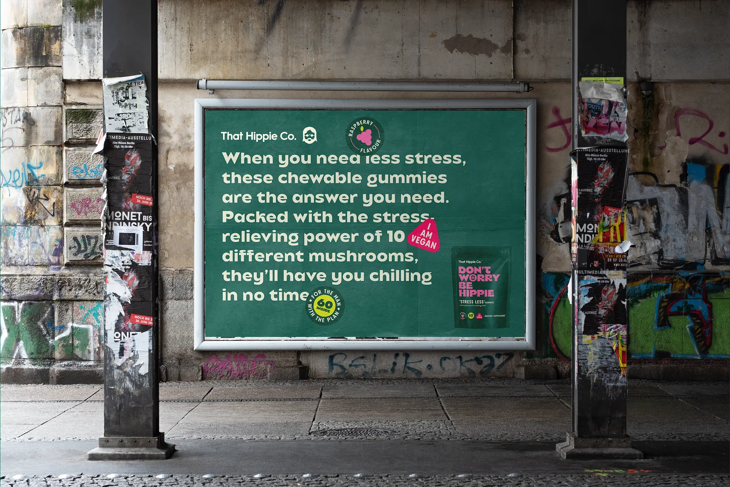
Humour-infused copy and benefit-first messaging brought lightness to serious topics, helping the brand connect through relatability, not pressure.
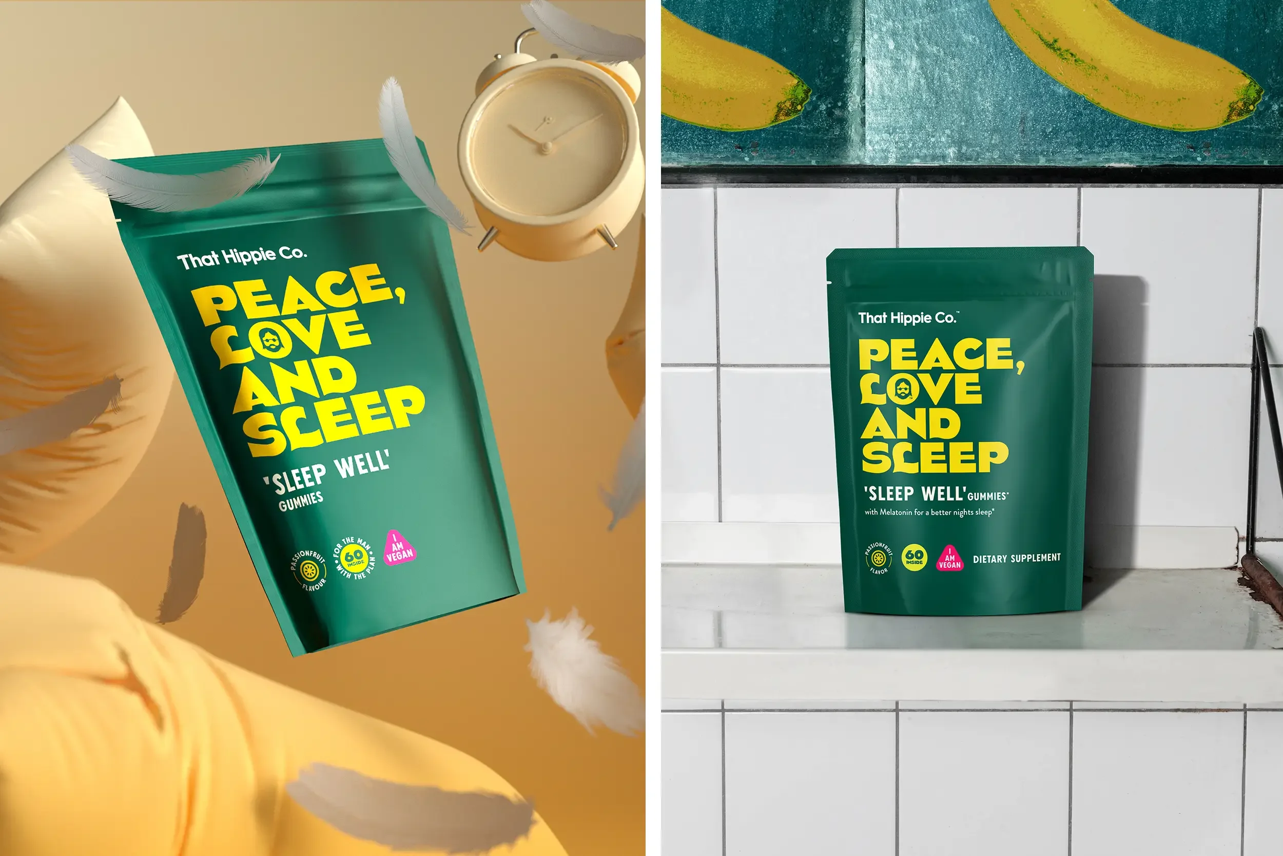
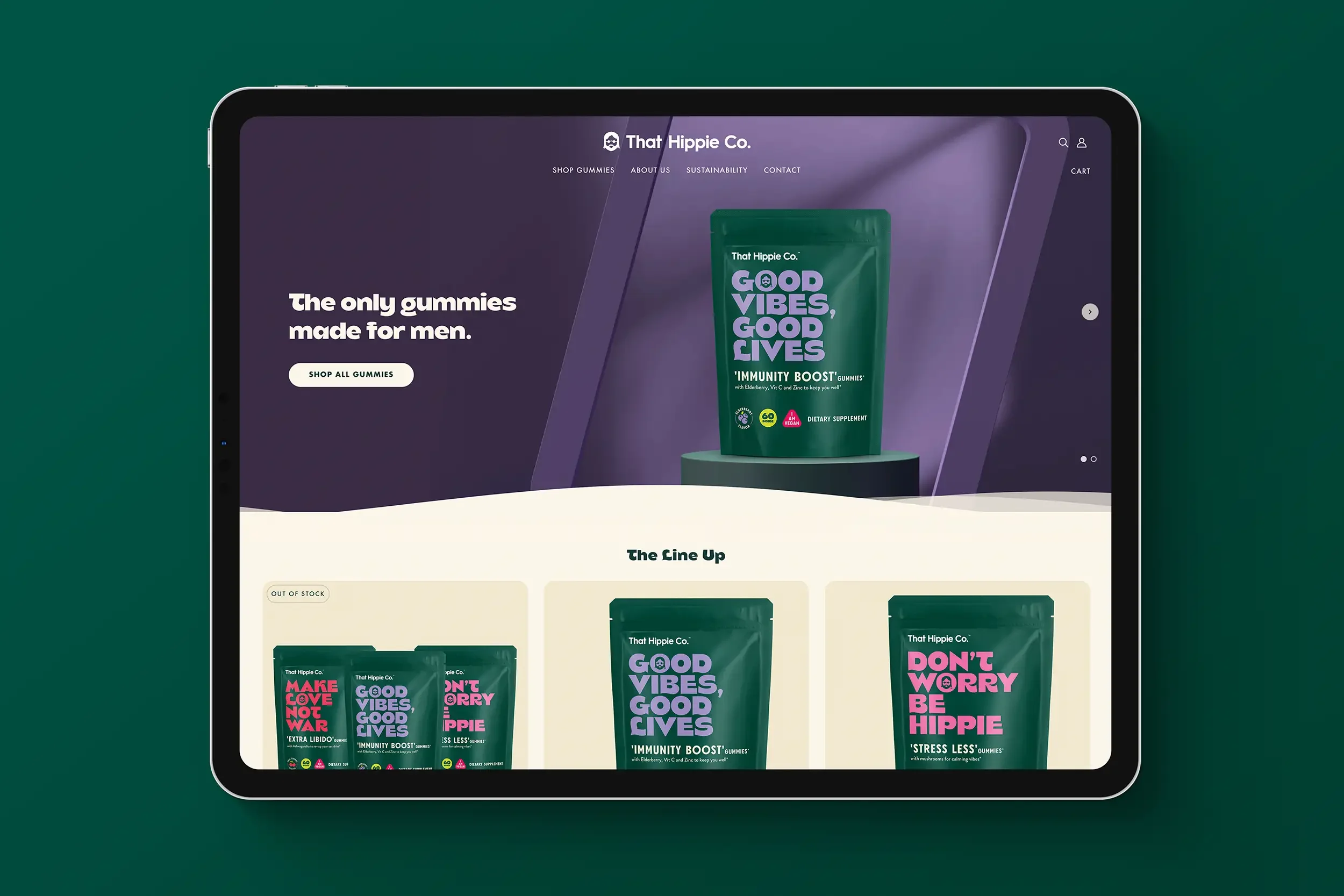
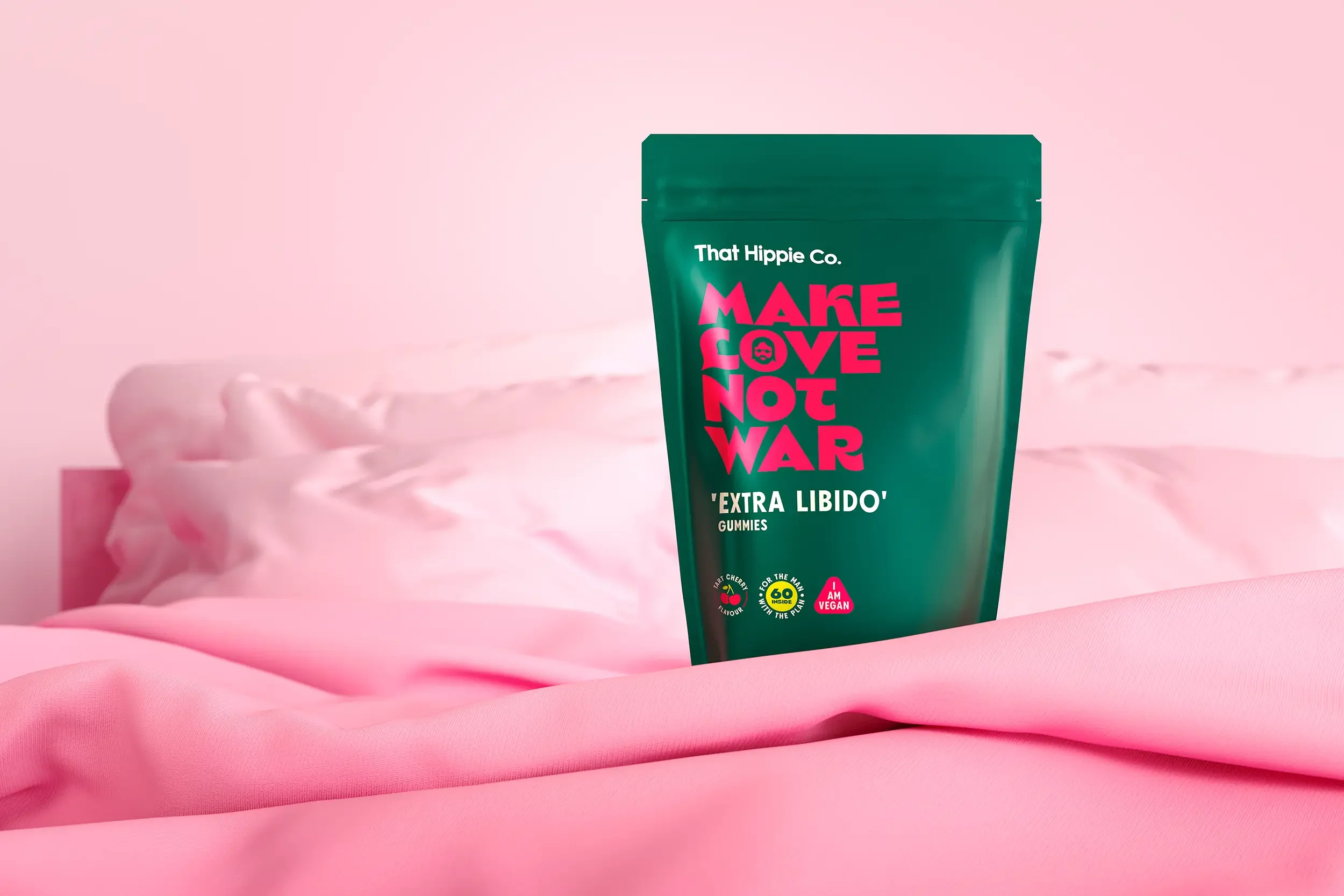
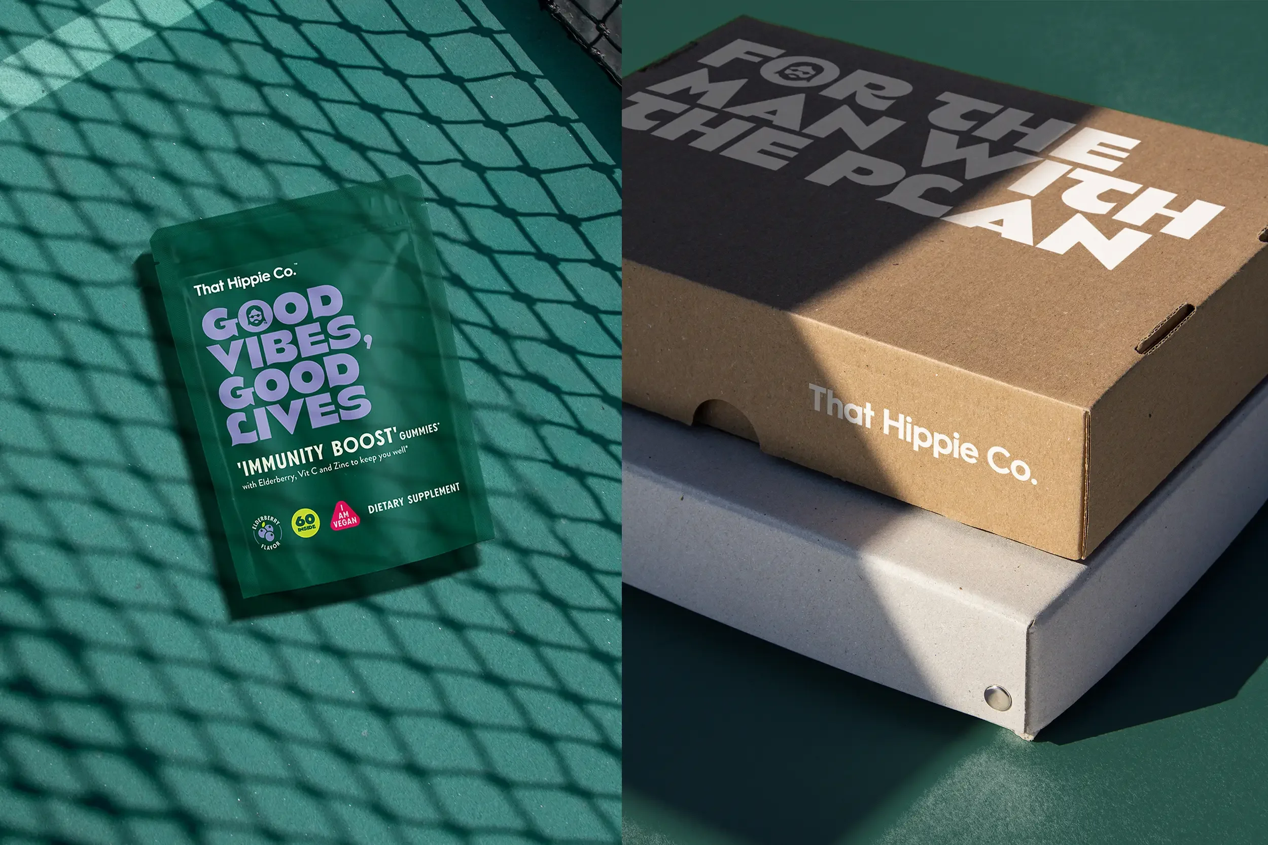
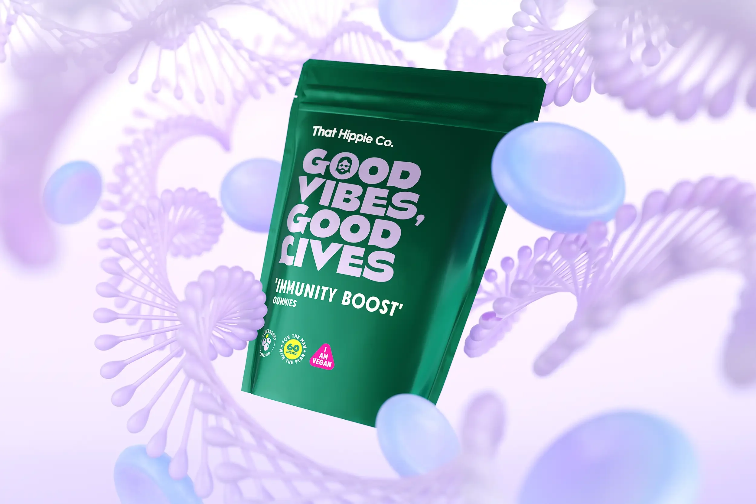
The packaging strikes a balance between playful and premium. Clean layouts, bold type, and confident colour blocking give the brand shelf standout, while also feeling right at home on a bedside table or bathroom shelf. Variant names are upbeat and benefit-driven — cutting through with clarity while keeping things light.
The result is a brand that doesn’t shy away from life’s messier bits — it meets them with warmth, wit, and a gentle reminder that looking after yourself can actually feel pretty good.