down in the dumplings
*
down in the dumplings *
BRENDAN PANG
Brand Narrative
Brand Identity
Packaging Design
Illustration
Art Direction
Created at Our Revolution
How It Started.
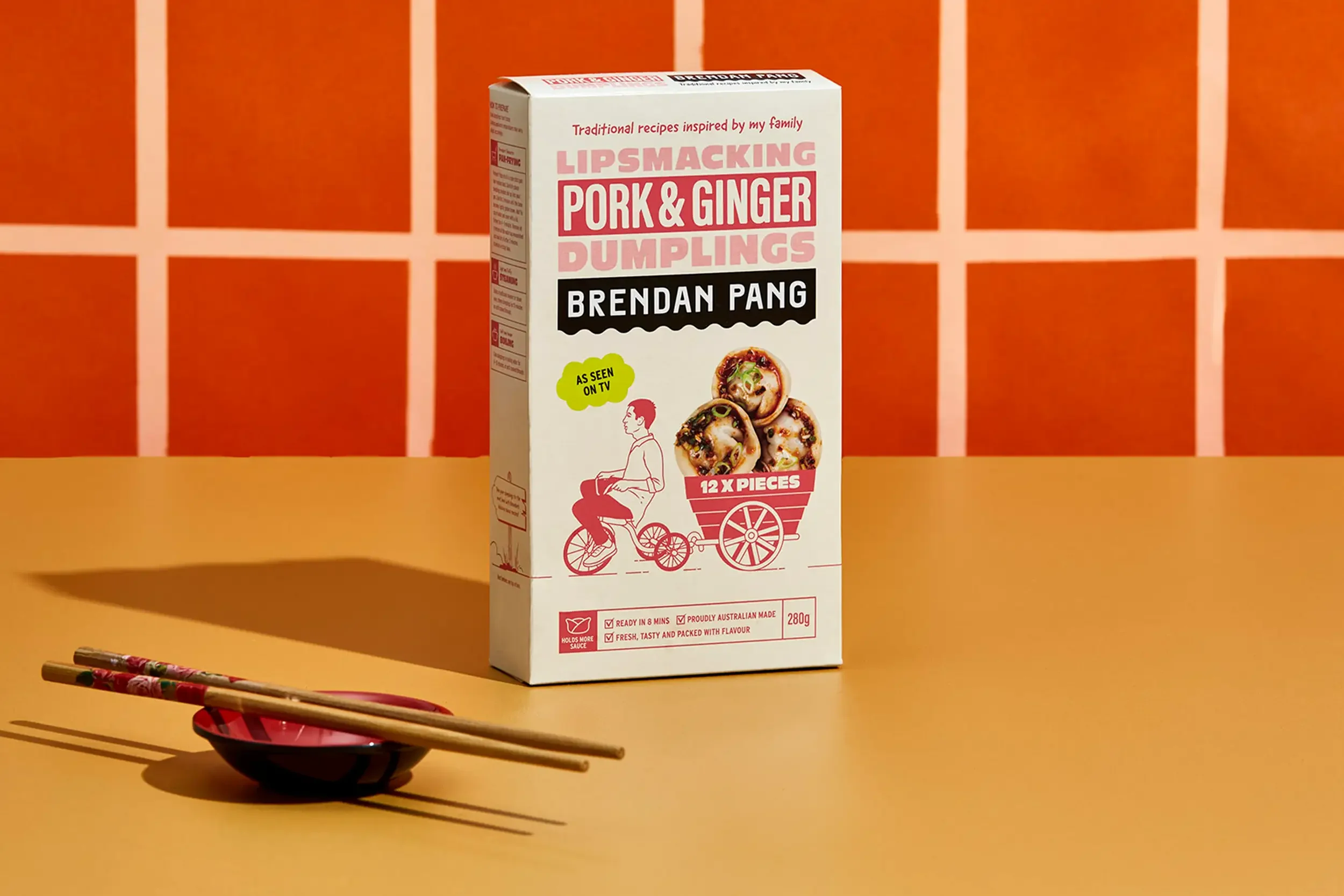
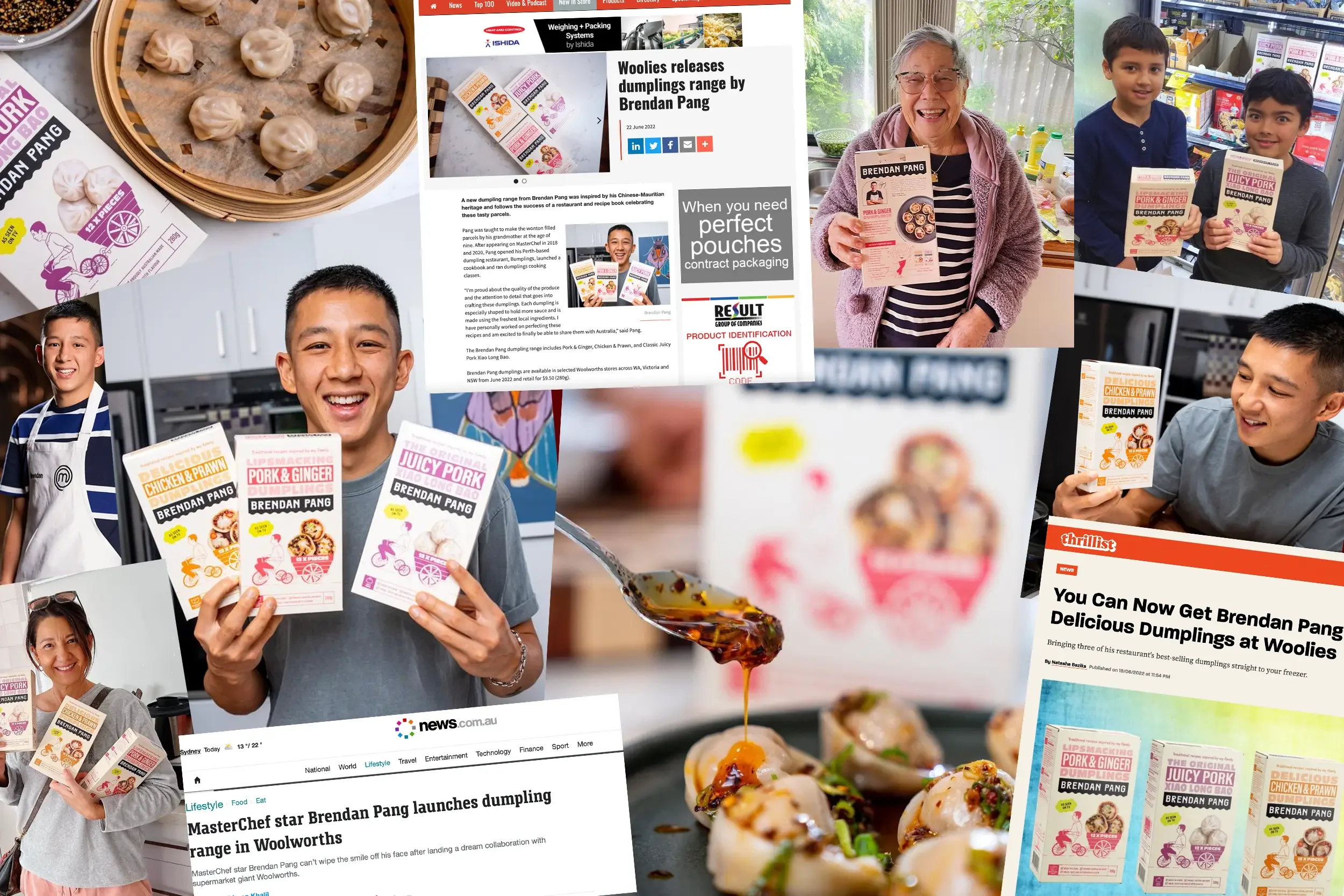
After two standout appearances on MasterChef Australia, Brendan Pang set his sights beyond the screen — aiming to bring the flavours of his Chinese-Mauritian heritage to everyday Australians.
His idea was simple: take the humble dumpling and elevate it with authenticity, story, and soul. But breaking into the freezer aisle wasn’t just about good food — it was about building a brand that could cut through a crowded category and speak to a new generation of shoppers who crave both flavour and meaning.
The challenge? Creating a brand that felt as personal and hand-crafted as the dumplings themselves.
What We Did About It.
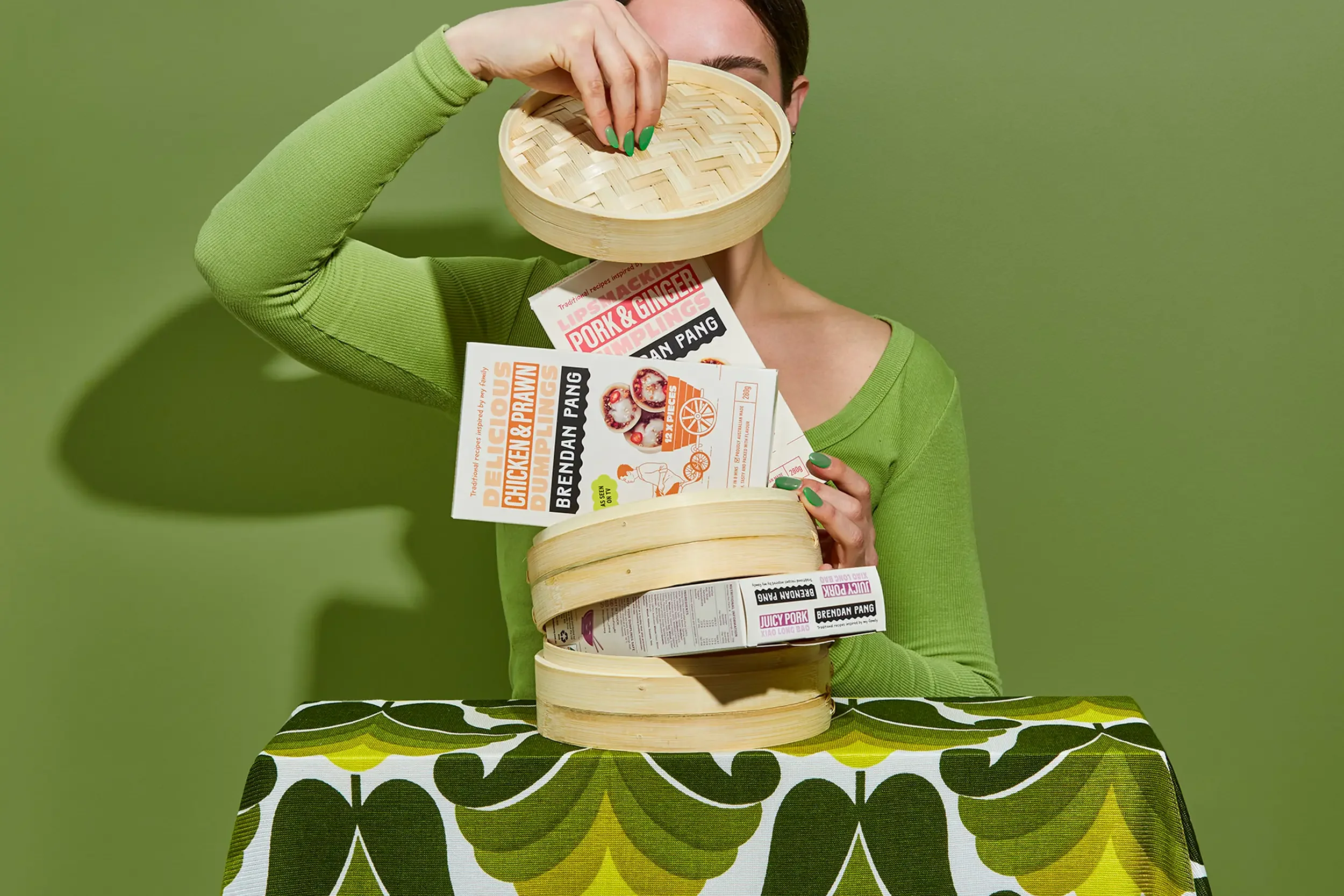
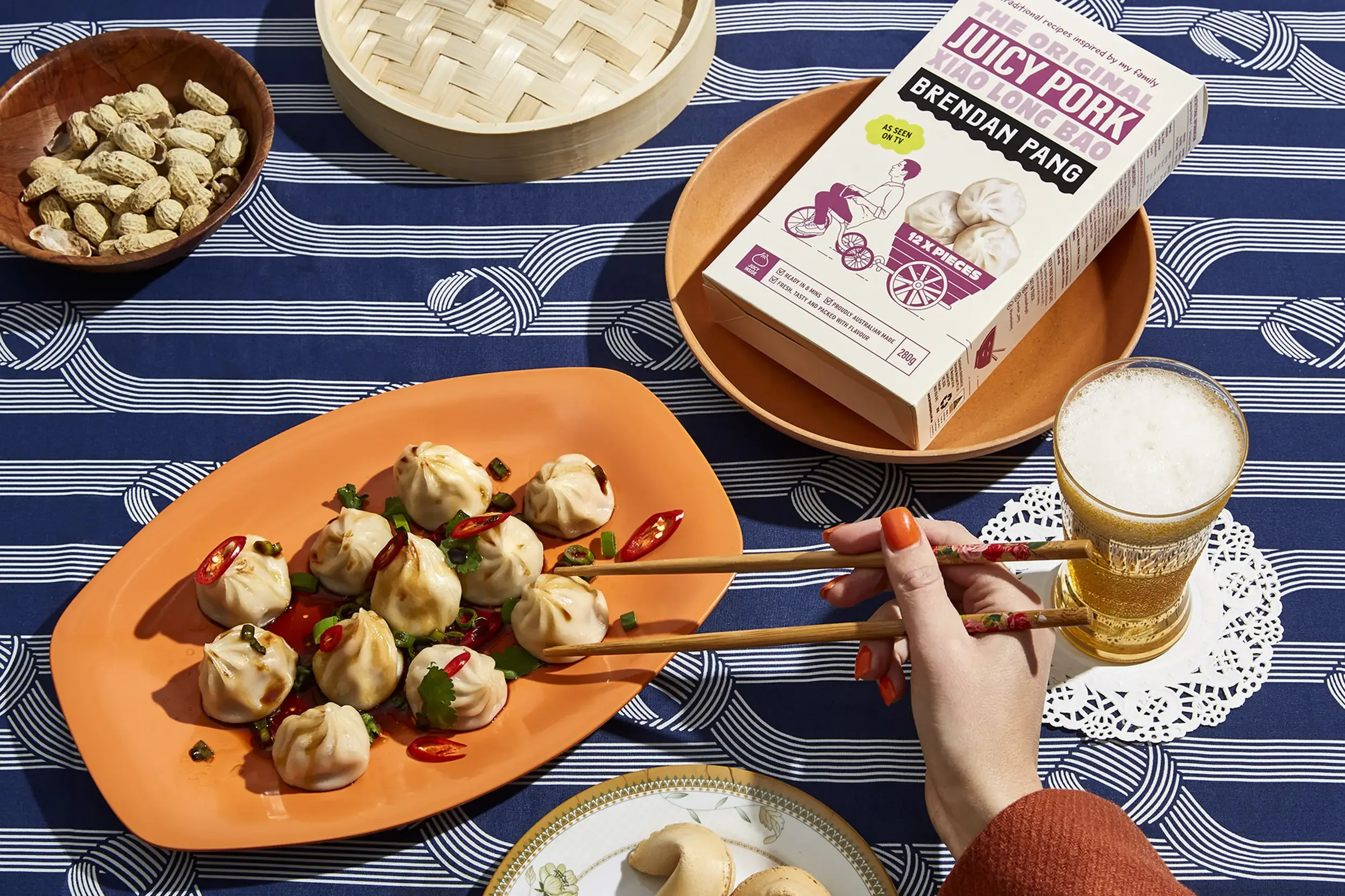
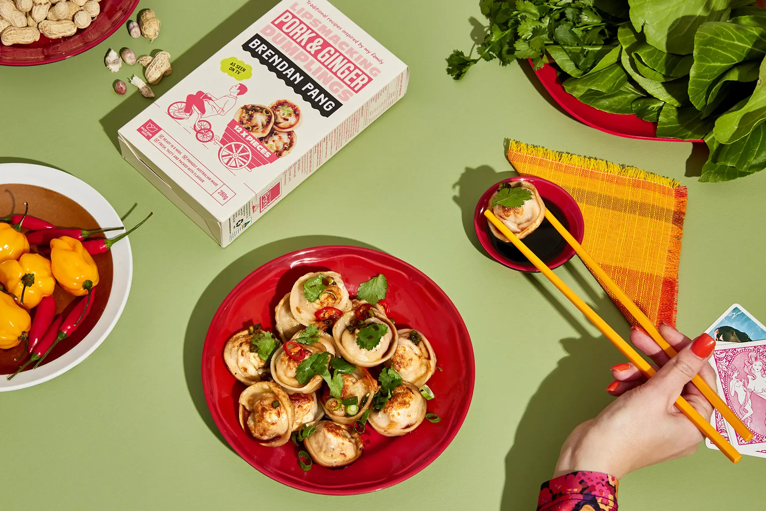
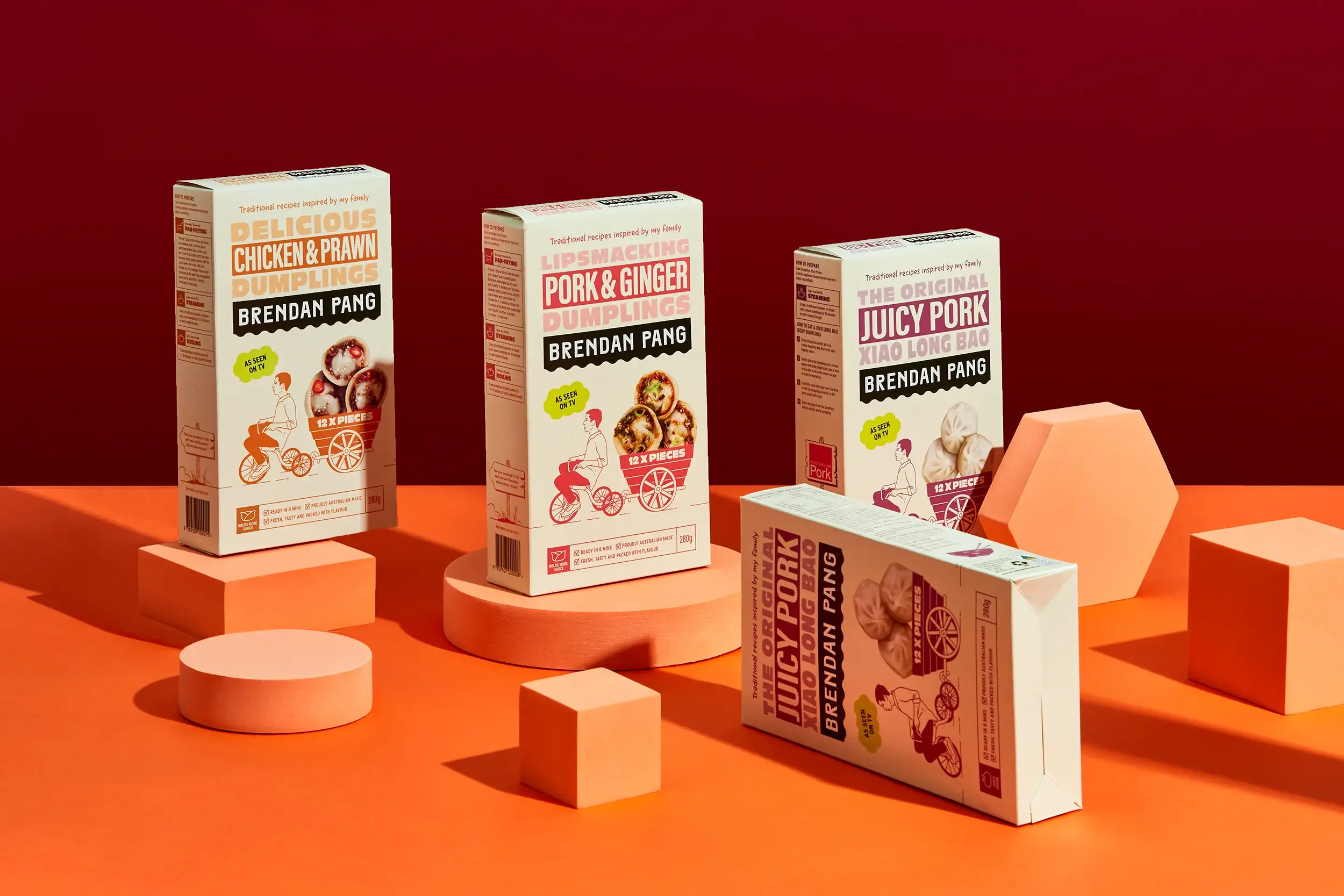
We brought Brendan’s vision to life through a brand identity rich in character, charm and cultural pride.
Playful illustrations of Brendan folding dumplings by hand tell a story of care and heritage, while a bold colour palette and modern, approachable typography give the range a distinct presence in the freezer aisle.
Every design decision was made to feel personal and inviting — a reflection of Brendan himself. Launched nationally in Woolworths, the brand has redefined what dumplings can look like at retail: proud, bold, and full of flavour.
A modern take on tradition, ready to be shared at home.