a dollop of wonder
*
a dollop of wonder *
CHOBANI NATURAL
Packaging Design
Illustration
Created at Our Revolution
How It Started.
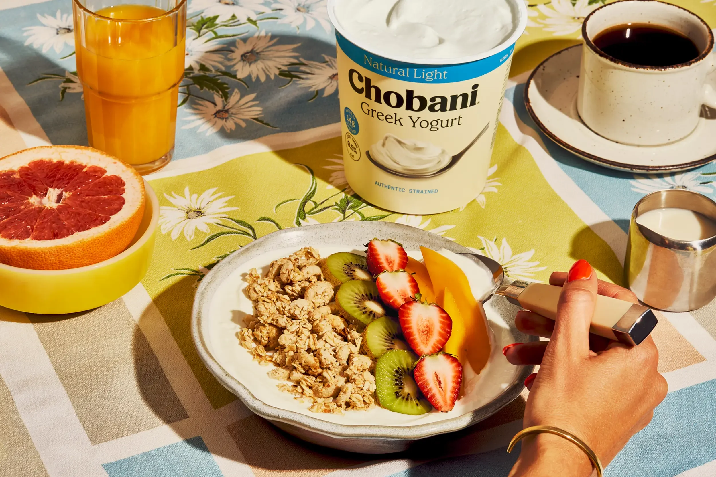
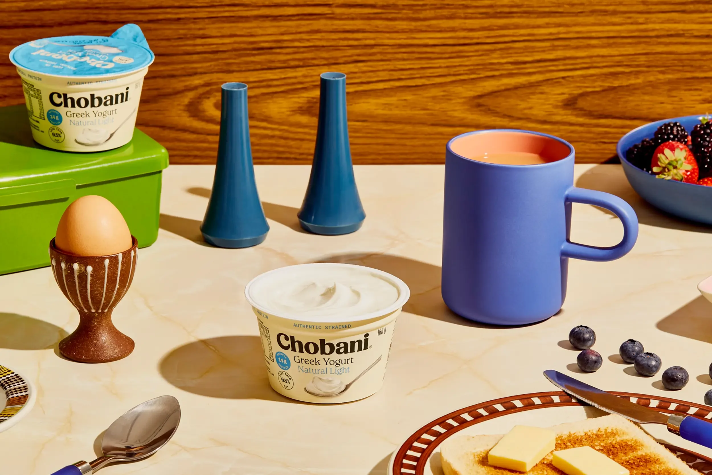
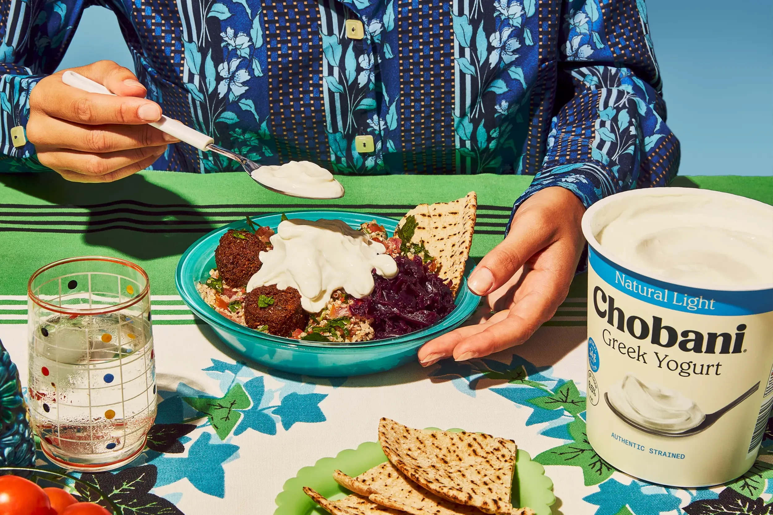
At the heart of Chobani’s Greek Yogurt portfolio sit their most pure and trusted products — Natural and Natural Light. Made using a traditional triple-straining method, they’re rich in protein, thick in texture, and loved for their signature tang.
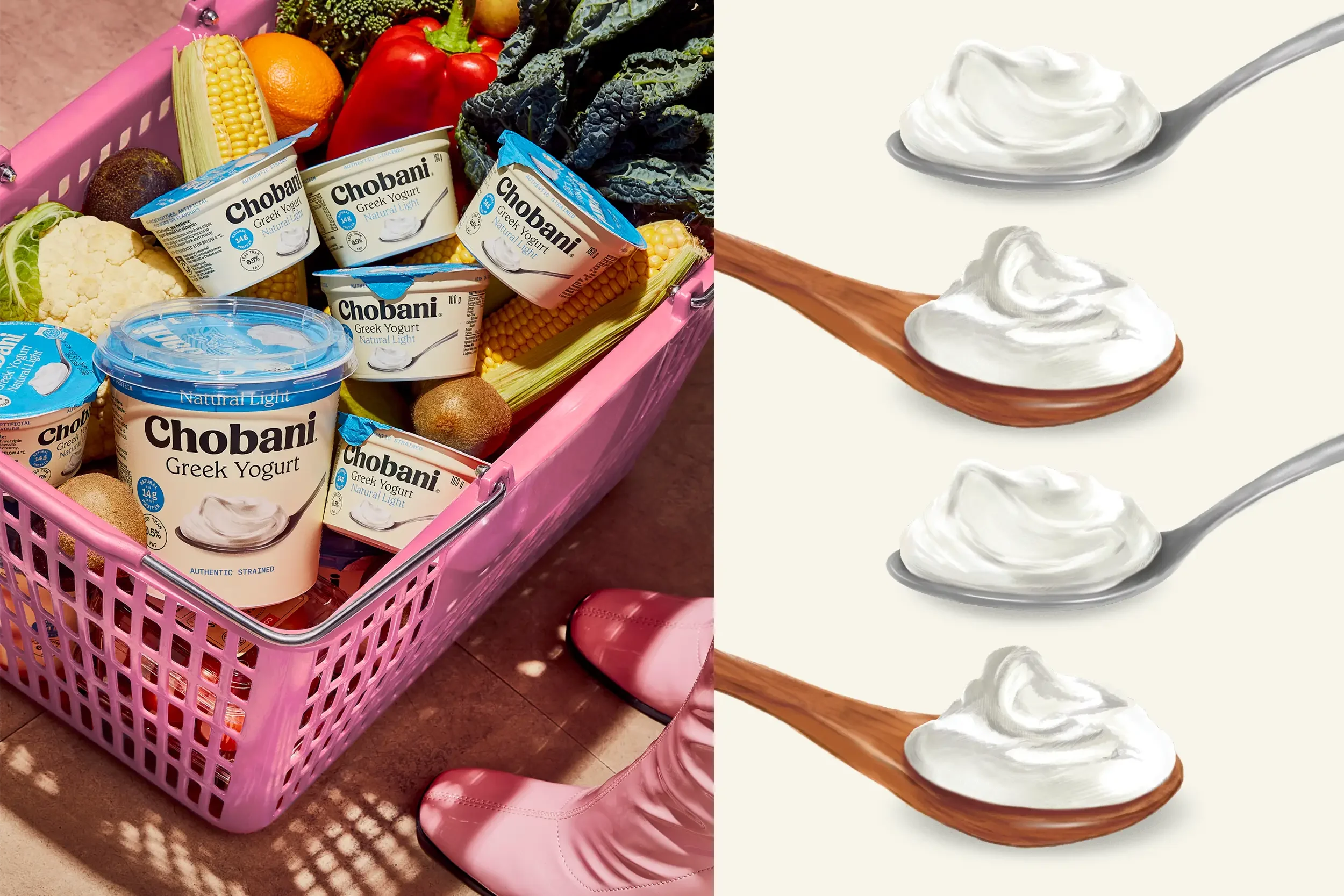
But despite their quality, the packaging felt out of step with the local market. Originally designed with cues from the U.S. range, these key variants lacked relevance for Australian shoppers.
The challenge was to preserve Chobani’s global equity while creating a clear, localised expression that resonated in the dairy aisle — where simplicity, trust, and appetite appeal drive choice.
What We Did About It.
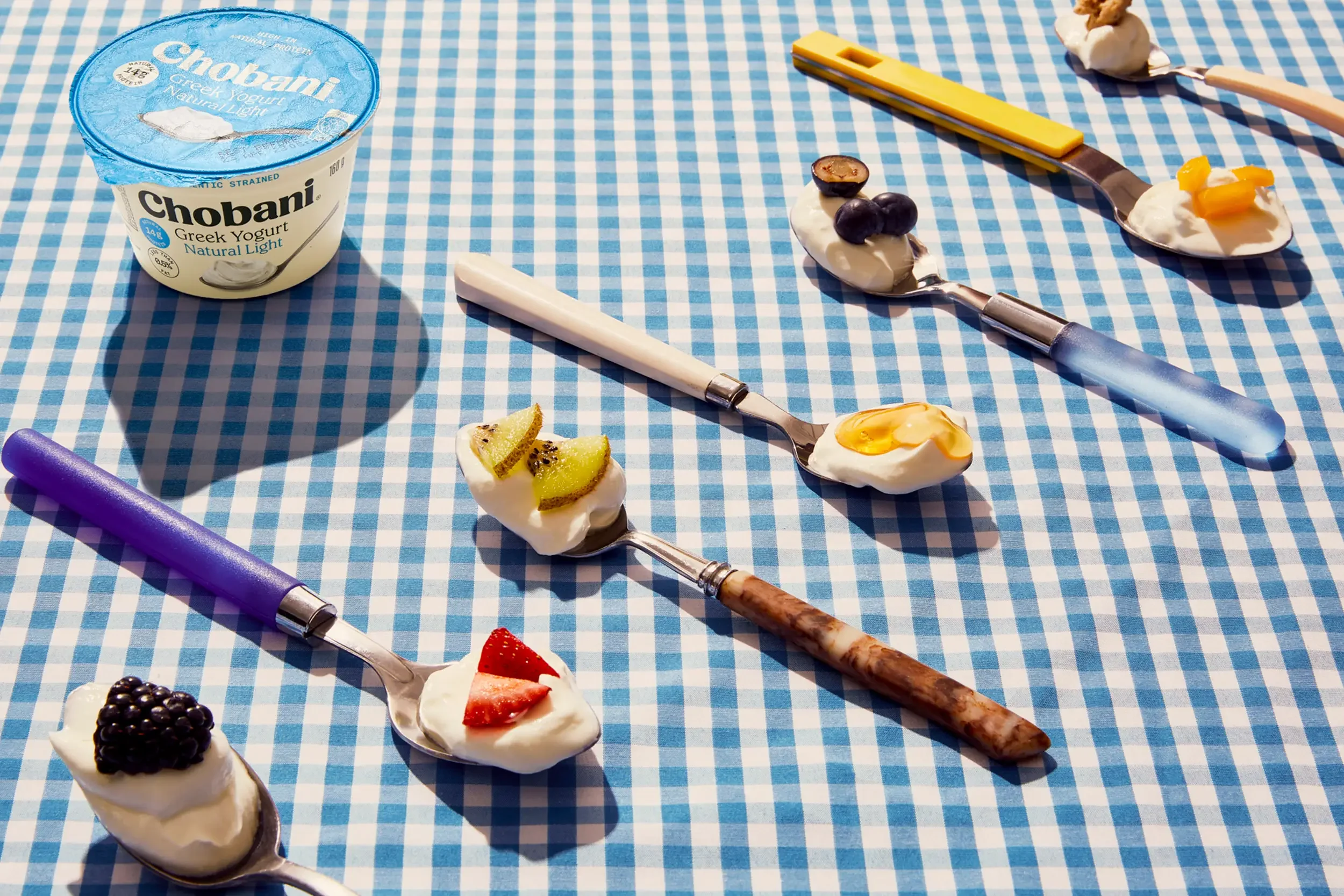
We crafted a refreshed packaging design that feels as clean and honest as the product itself. A soft cream base conveys purity and freshness, while bold accents of blue give a confident nod to Chobani’s Greek Yogurt leadership.
The design features hand-illustrated spoon assets — silver for Natural, wood for Natural Light — capturing texture and evoking a real, wholesome food moment. Every element was carefully considered to connect with Australian shoppers and elevate this core range without overcomplicating it.
The result is packaging that feels familiar, premium, and proudly local — reinforcing Chobani’s role as a trusted staple in everyday meals.