A sip of simpler times
*
A sip of simpler times *
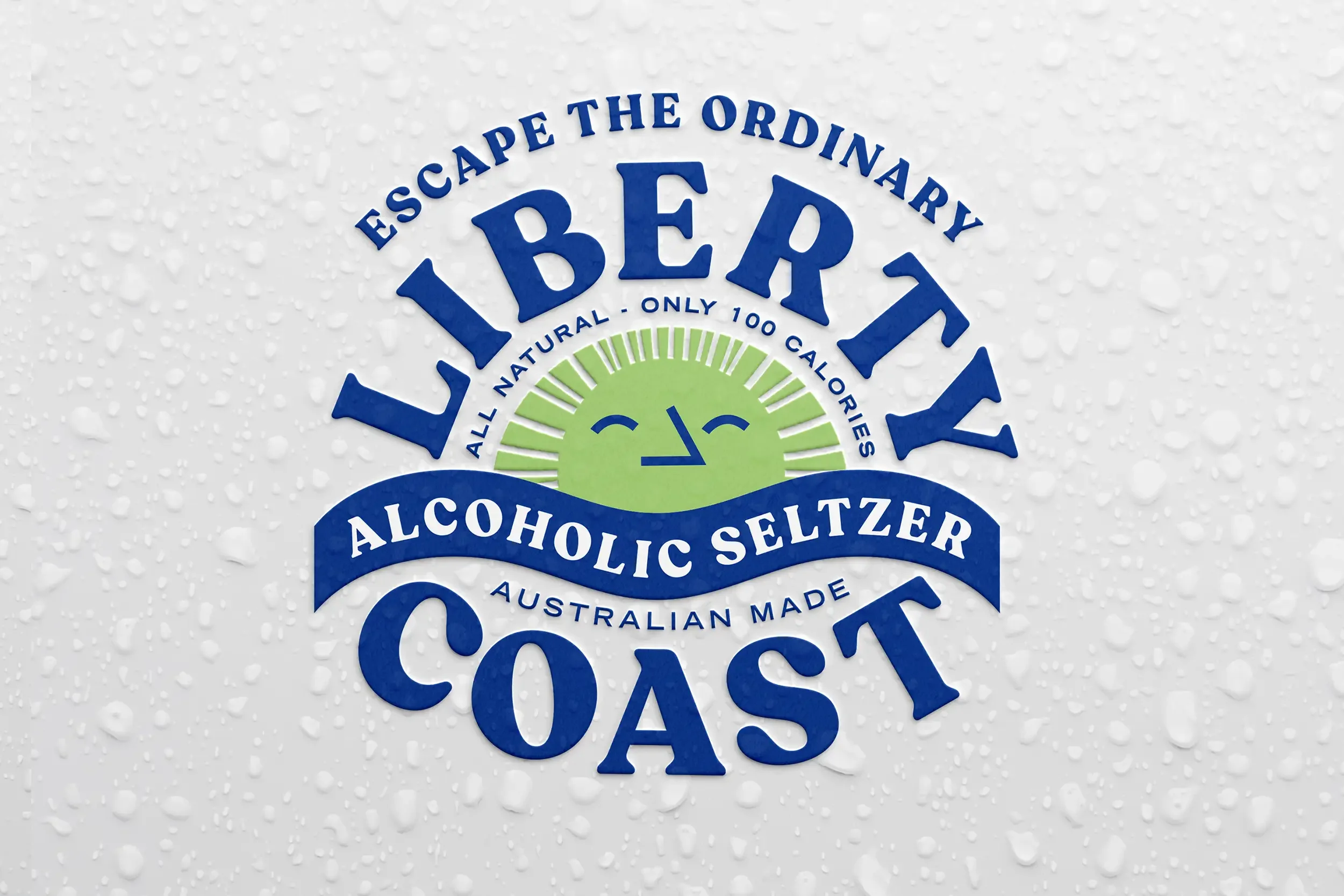
LIBERTY COAST
Brand Naming
Brand Narrative
Verbal Identity
Brand Identity
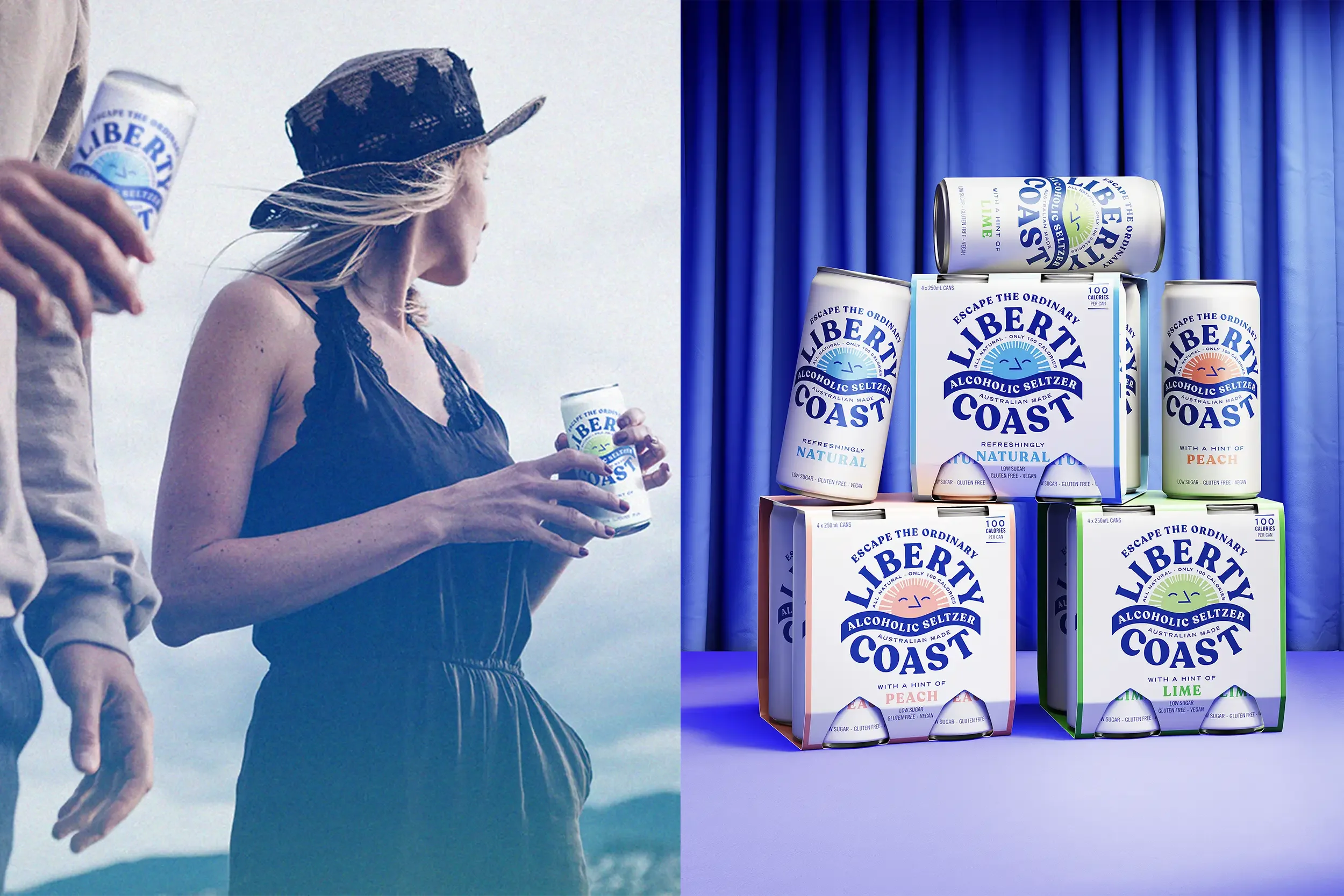
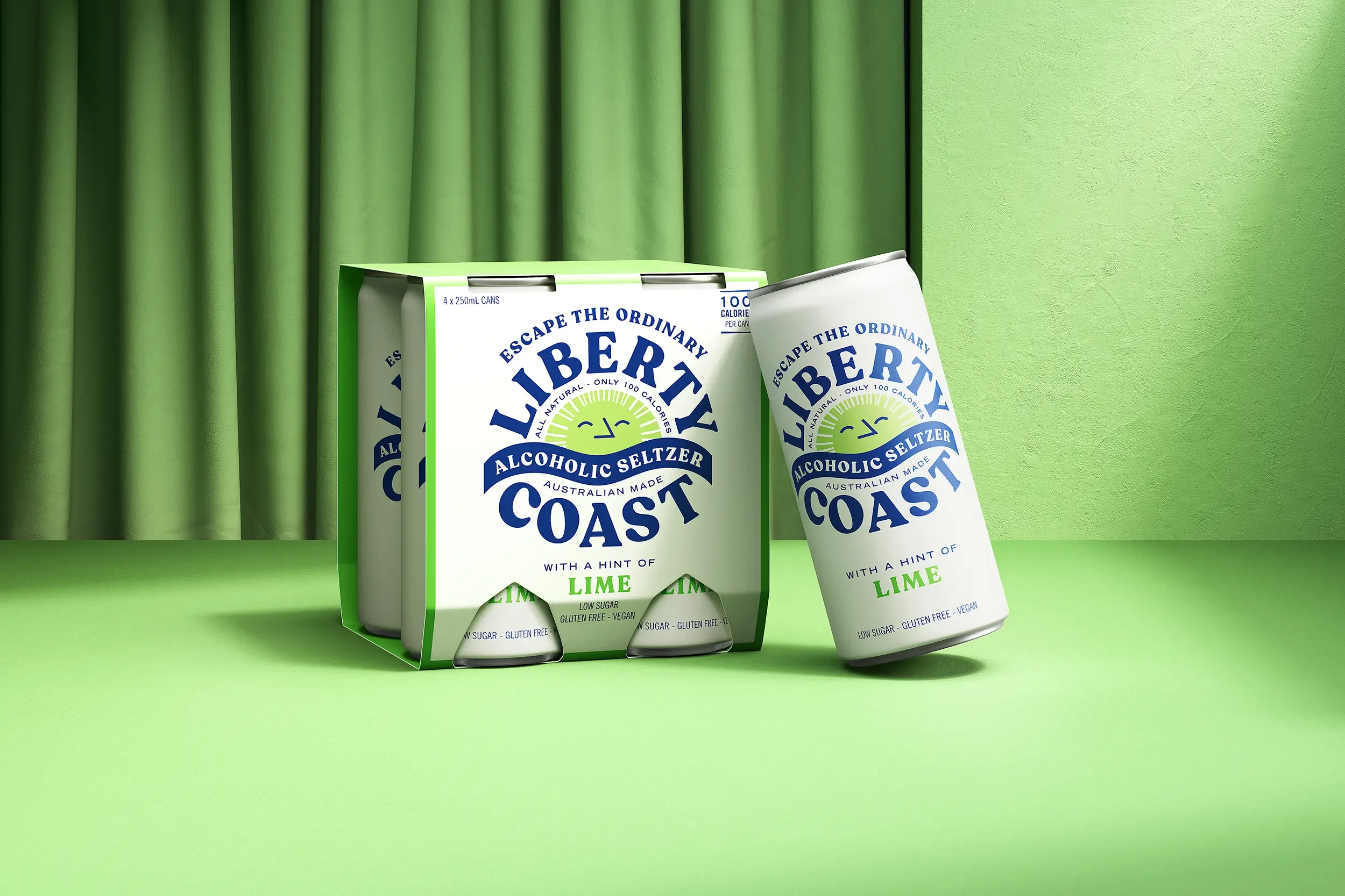
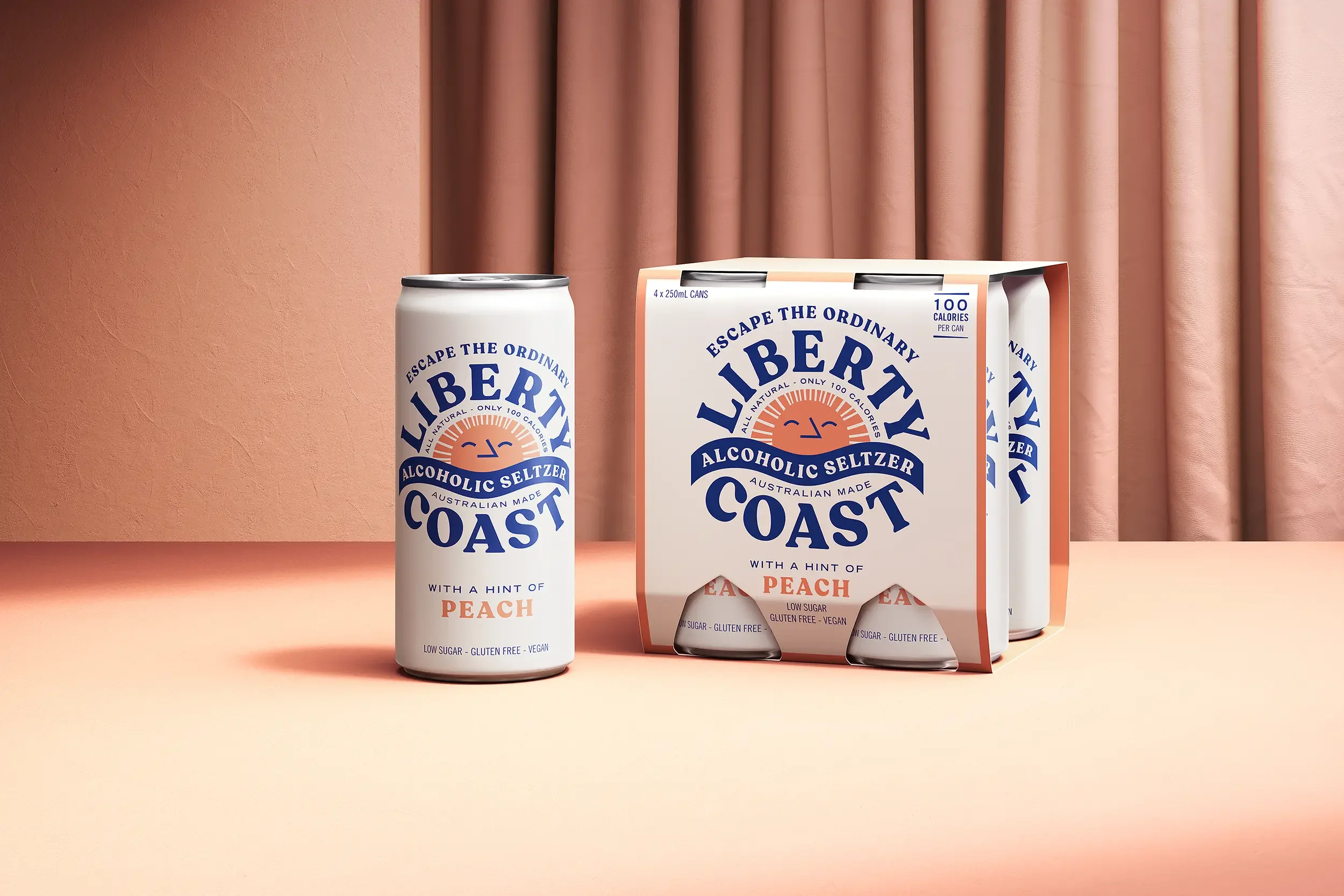
Packaging Design
Illustration
Art Direction
Created at Our Revolution
How It Started.
The global rise of hard seltzers has reshaped how we drink — lighter, cleaner, and better for you. But beyond the stats and claims, it’s also a lifestyle shift. A cultural movement toward simplicity, balance, and escape.
Our challenge was to create a new brand for the Australian market that didn’t just sell refreshment, but captured the feeling of stepping away — unplugged, unrushed, and utterly at ease. One that offered a natural, flavourful alternative while embracing the modern desire to slow down, tune out, and savour the moment.
What We Did About It.
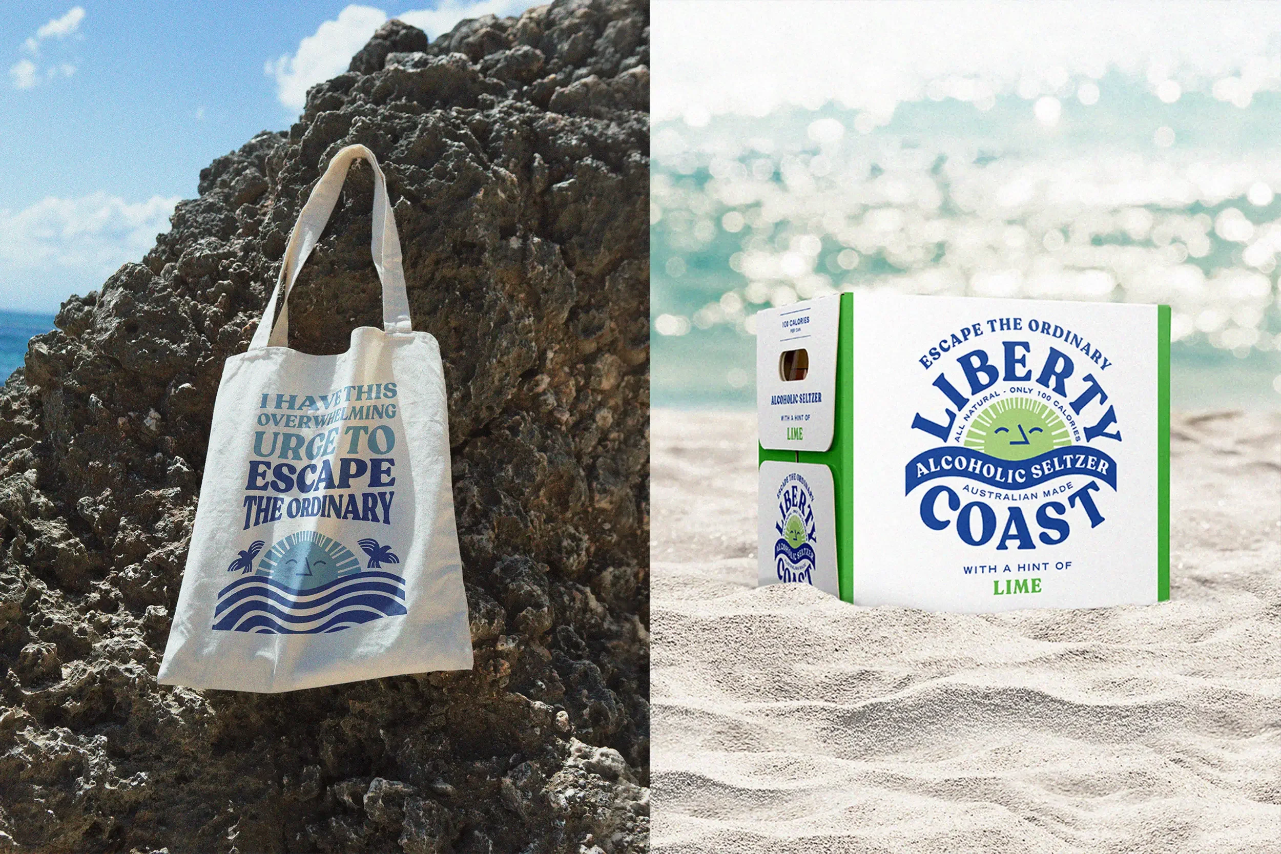
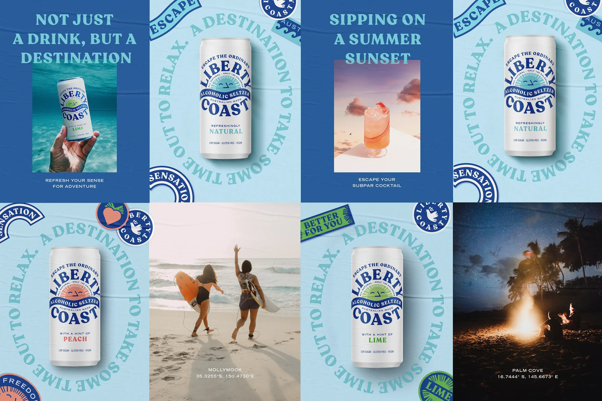
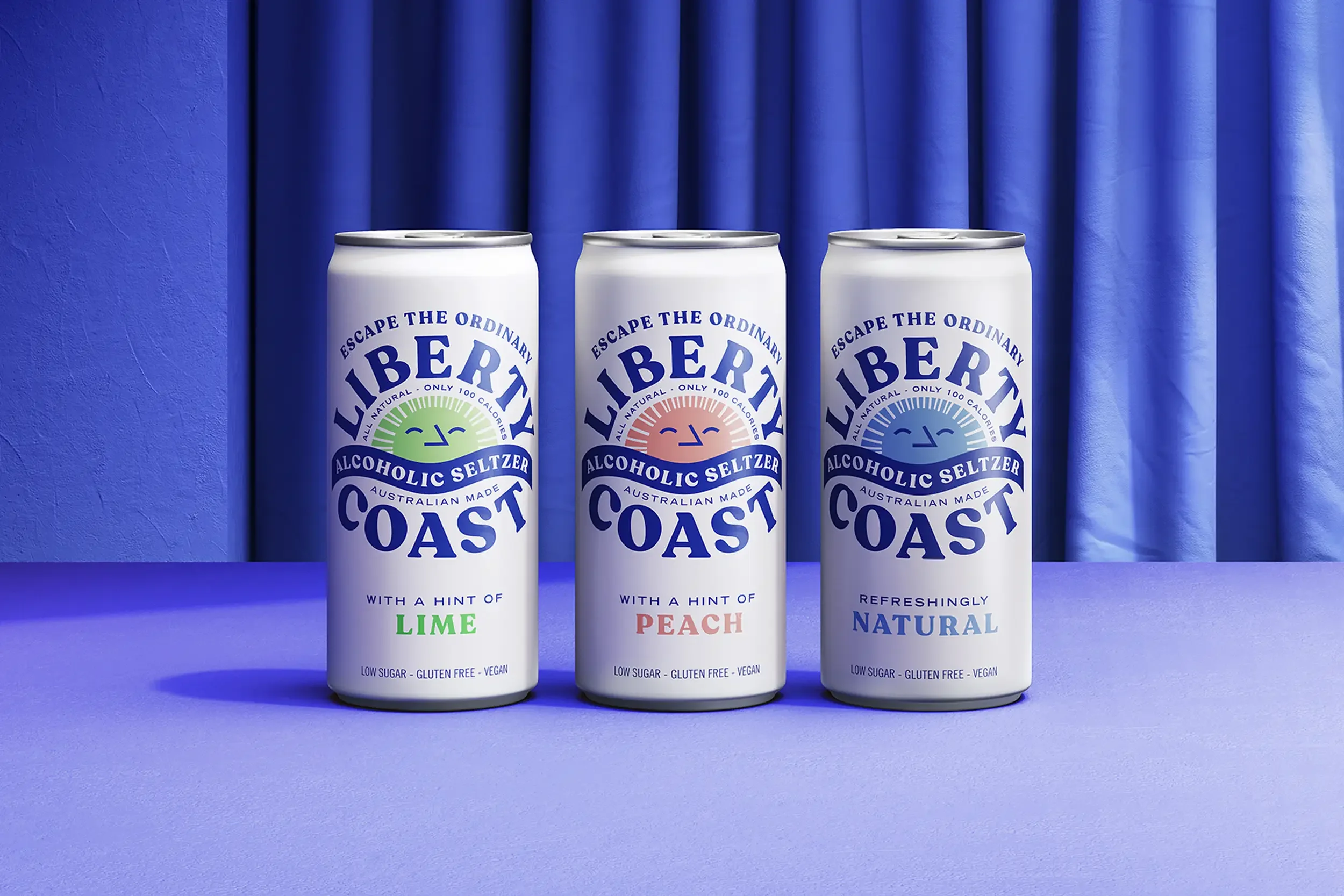
We created Liberty Coast — a brand that speaks to the freedom of the coast and the calm that follows disconnection. The name itself is aspirational, evoking warm breezes, open spaces and a slower pace. Visually, we leaned into a nostalgic design language inspired by ‘70s summer camps, faded travel posters, and natural colour palettes. Each can feels like a postcard from a simpler time — with sun-washed tones, whimsical typography, and illustrations that frame flavour through a lens of nature and memory.
The result is a hard seltzer brand that feels distinctively Australian, emotionally resonant, and refreshingly different from the minimalist tropes of the category. Liberty Coast invites drinkers not just to sip, but to pause, drift, and reconnect with the world around them.