Less sugar, same soul
*
Less sugar, same soul *
CHOBANI - NO SUGER ADDED
Packaging Design
Illustration
Created at Our Revolution
How It Started.
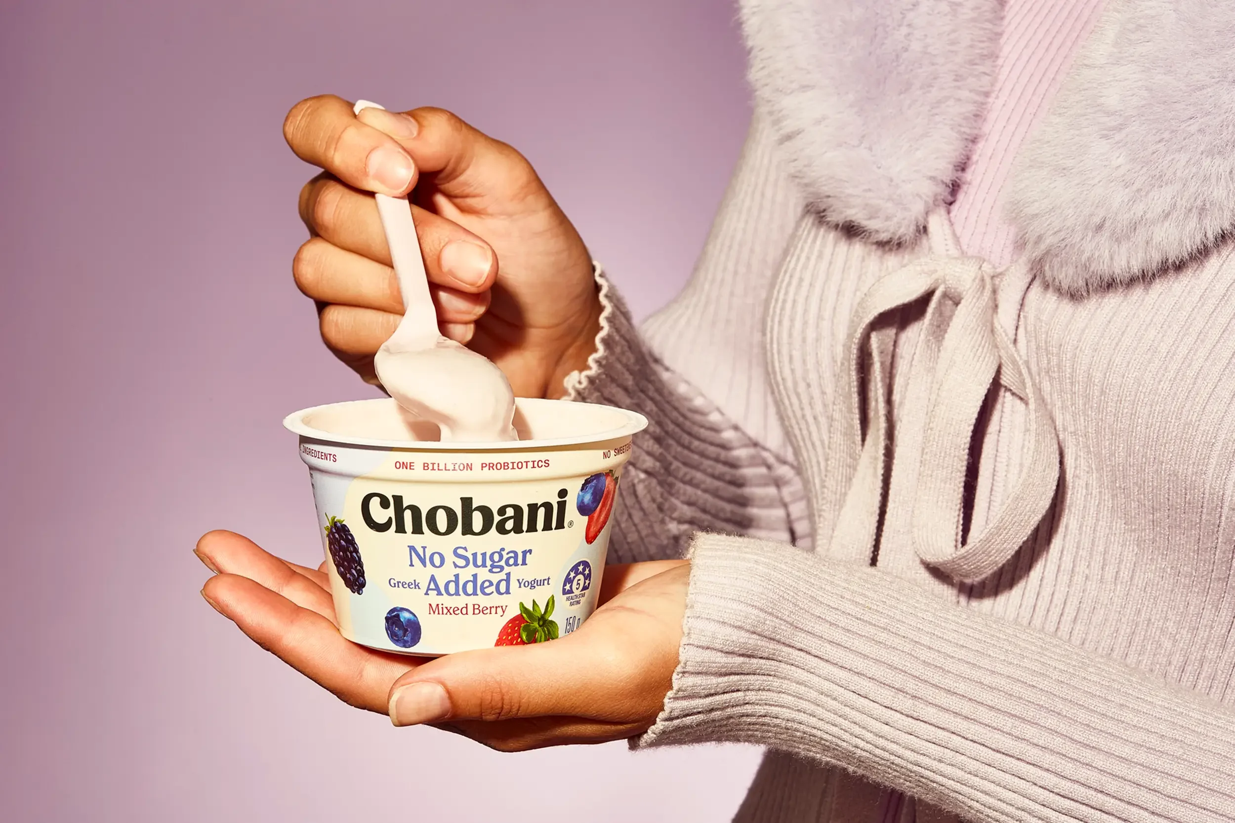
Sugar is under the microscope. With chronic disease and obesity on the rise, health-conscious consumers are increasingly seeking foods with less sugar and fewer additives.
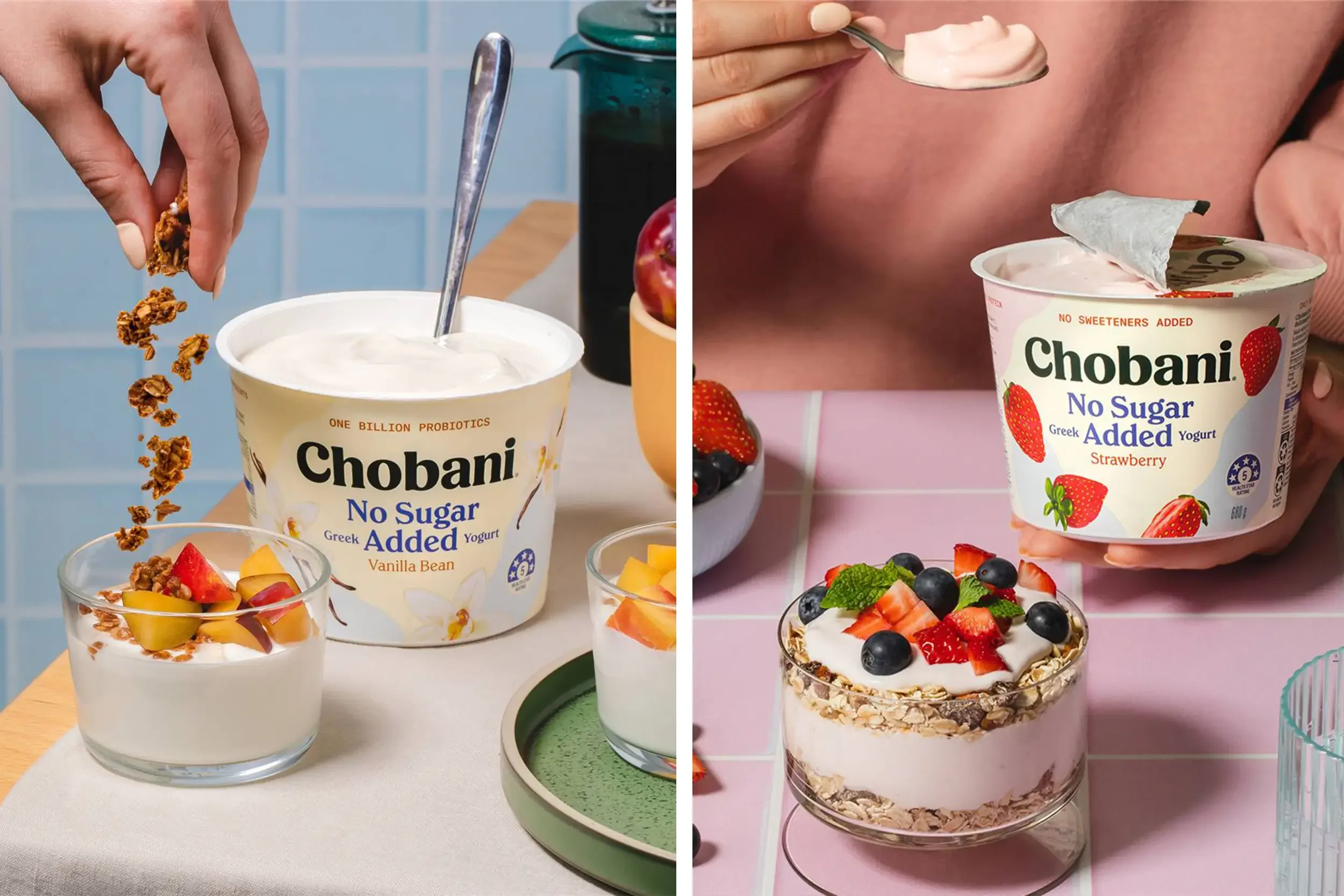
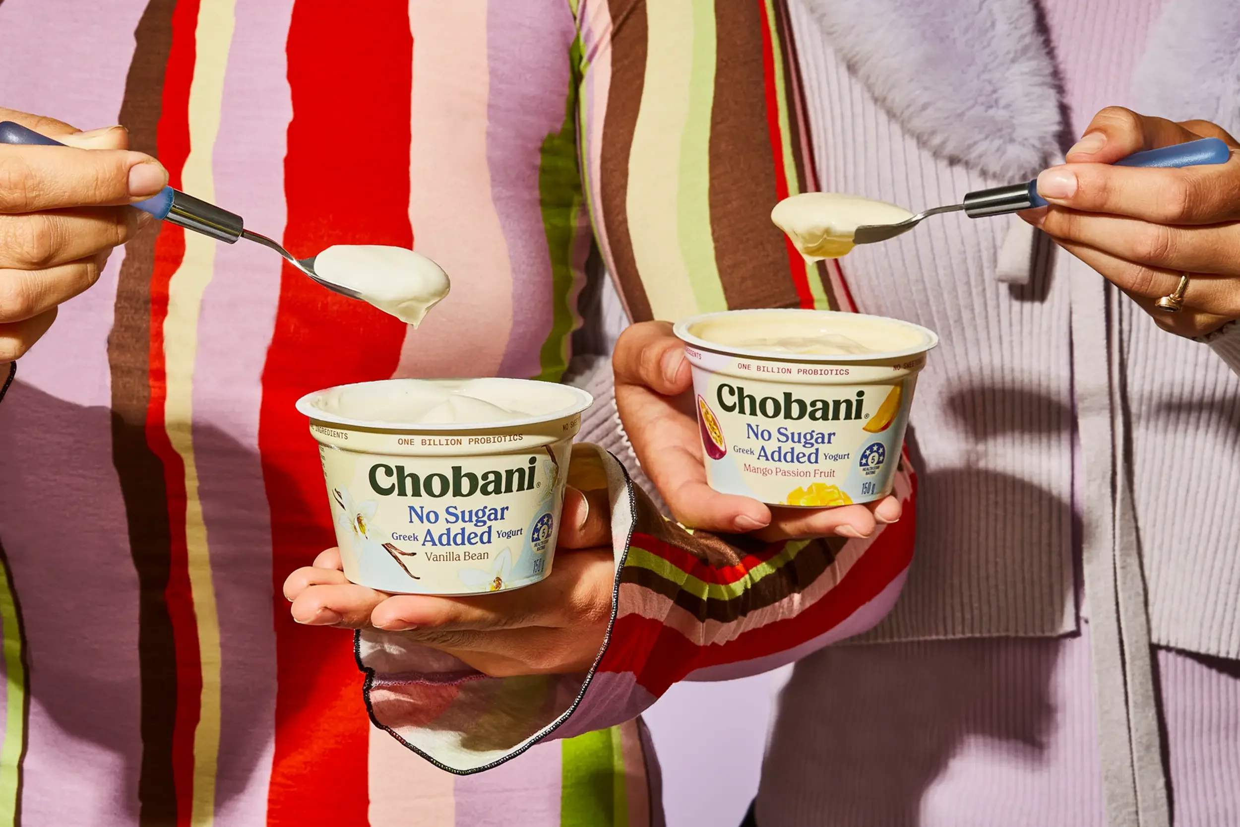
But the no-added-sugar yogurt category had a problem: most options relied on artificial sweeteners, delivering an experience that felt compromised — especially in taste. Chobani set out to change that, developing a yogurt that’s naturally lower in sugar, yet still rich in texture and flavour.
Our brief: help communicate this innovation through packaging that felt both distinct and distinctly Chobani — supporting the new product while staying true to the brand’s established warmth and simplicity.
What We Did About It.
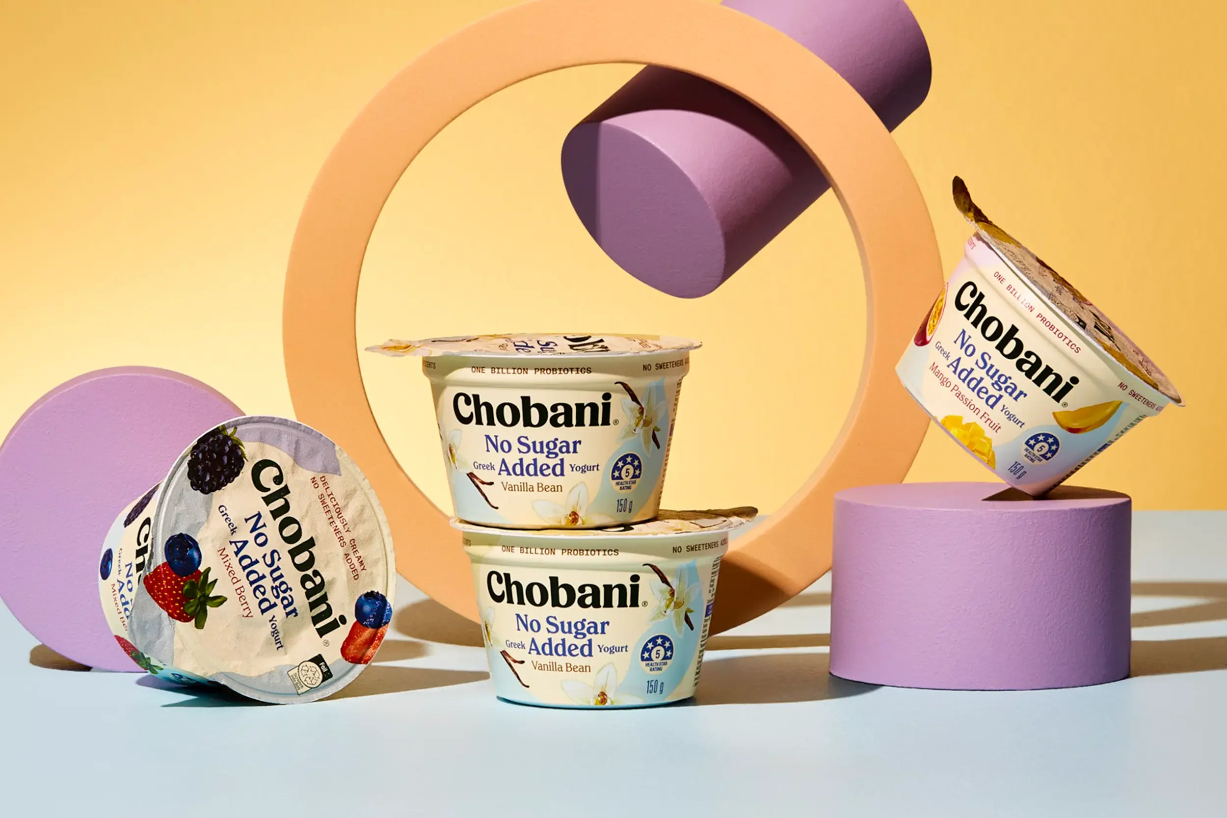
We designed a packaging system that gently steps out from the masterbrand, while preserving all the familiarity and trust Chobani has built.
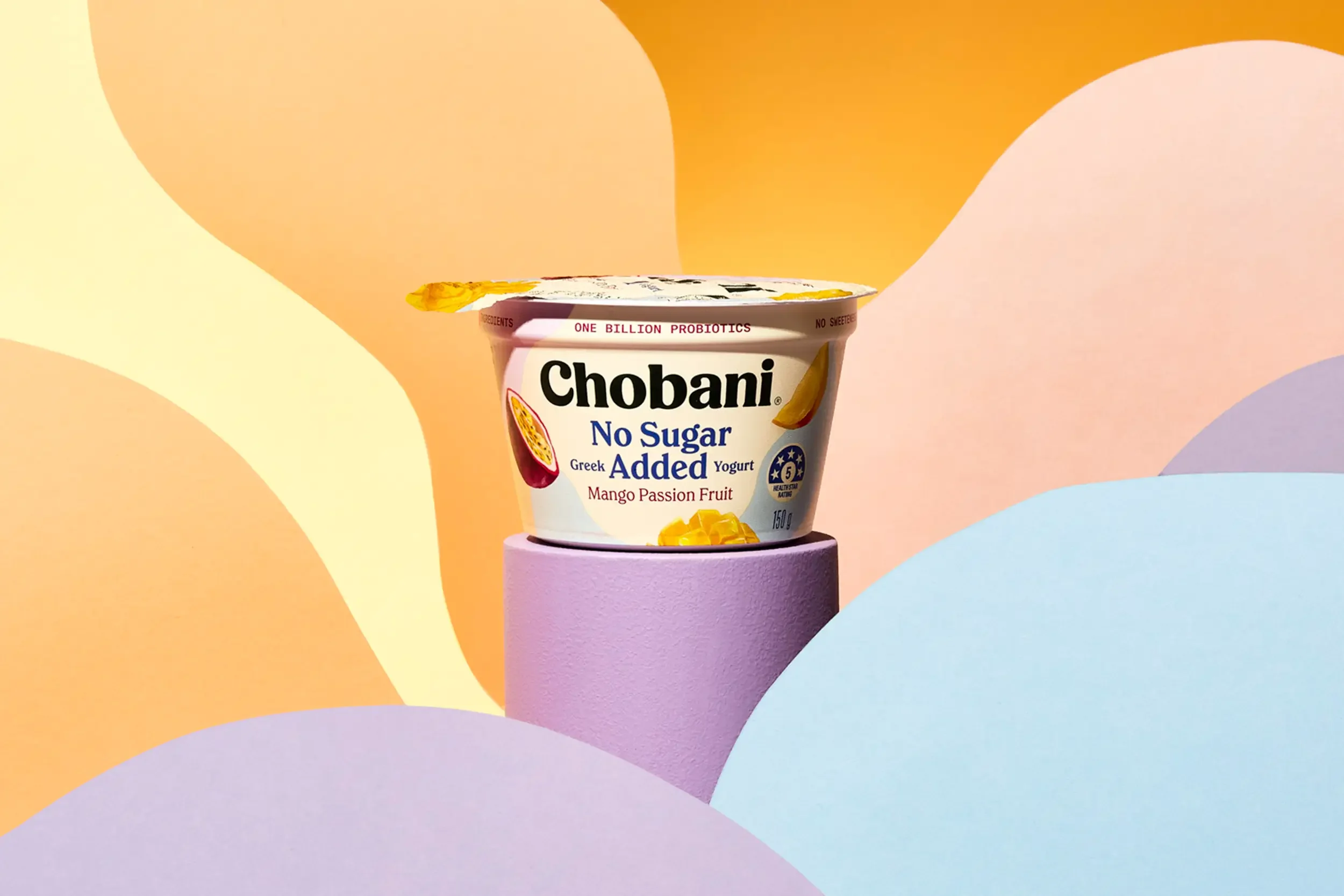
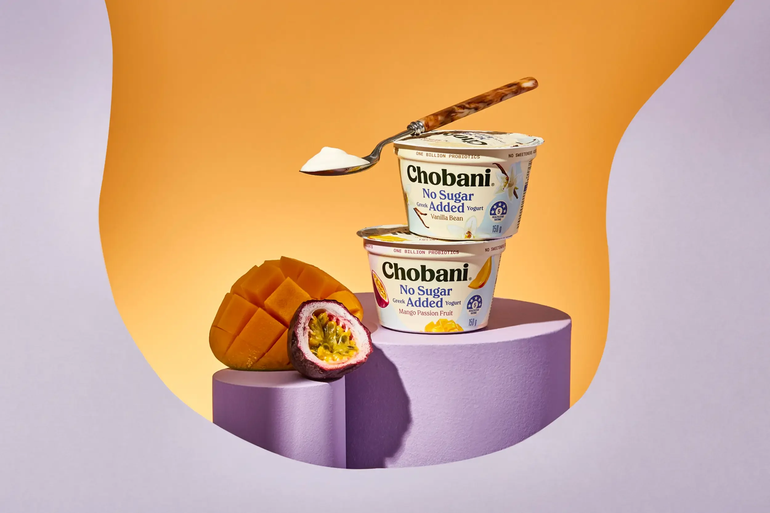
Curvaceous waves flow across the pack — a subtle cue to the yogurt’s creamy texture and natural ingredients — layered in soft pastel tones inspired by each fruit variant. The composition reimagines existing fruit illustrations to feel lighter, more delicate, and full of freshness.
We carefully restructured the hierarchy to hero the “No Added Sugar” message, balancing clarity with warmth. Every detail was thoughtfully considered — from the treatment of the Chobani marque to the quiet confidence of the typography — resulting in a sub-range that delivers on innovation without ever feeling clinical or cold.