a new ladle of love
*
a new ladle of love *
CAMPBELL’S
Packaging Design
Art Direction
Illustration
Created at Landor
How It Started.
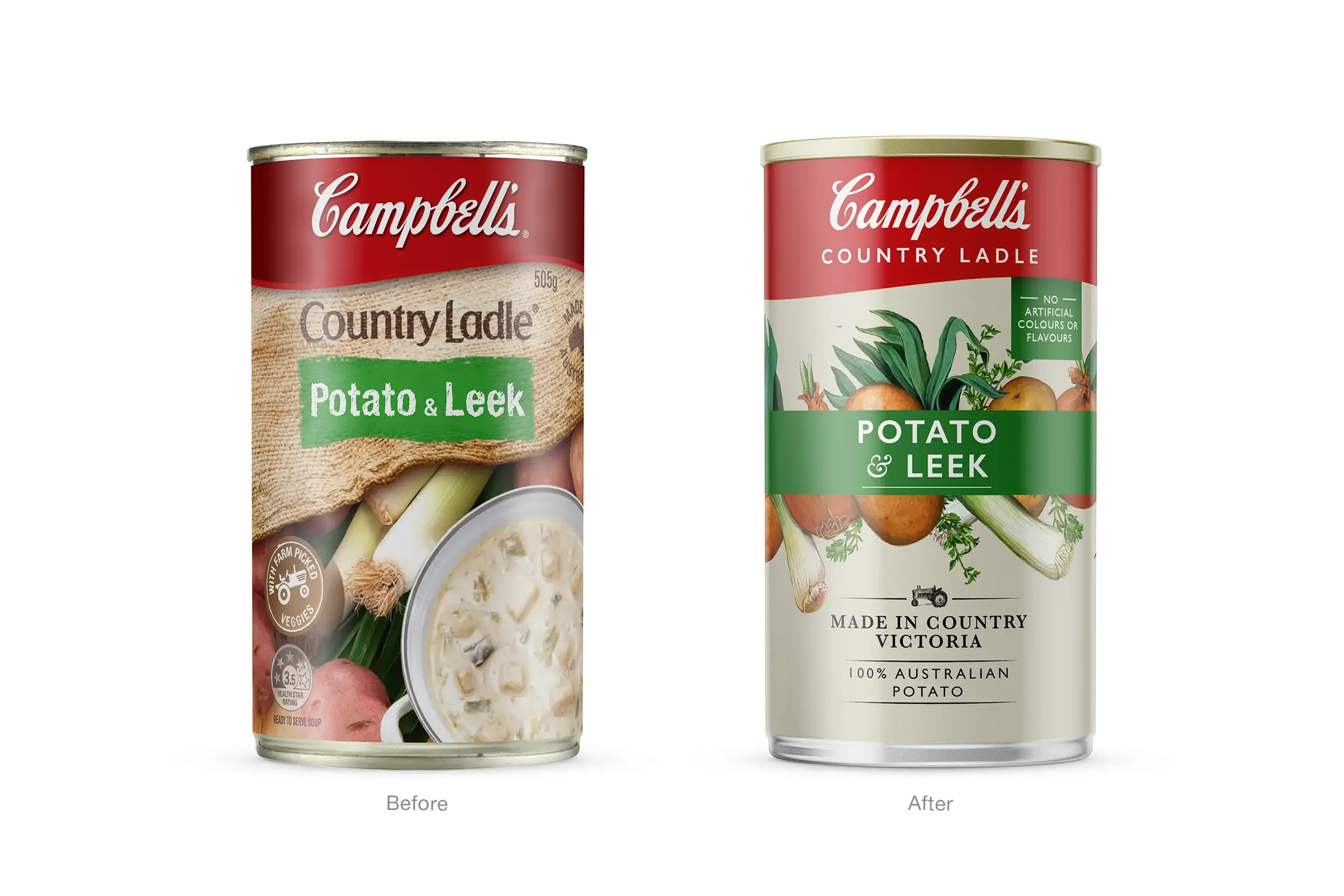
Campbell’s Country Ladle has long been a household name in Australia — a comforting, familiar presence in the soup aisle. But as consumer expectations shifted toward wholesome, premium convenience, the range needed a refresh that would reconnect with modern shoppers while preserving the brand’s heartland authenticity.
The brief was clear: elevate the everyday. We were tasked with reimagining the full Country Ladle portfolio — amplifying appetite appeal, reinforcing the brand’s farm-to-table story, and bringing greater clarity to shelf. The challenge was to evolve the brand without losing the warmth, trust, and homeliness that consumers had come to love.
What We Did About It.
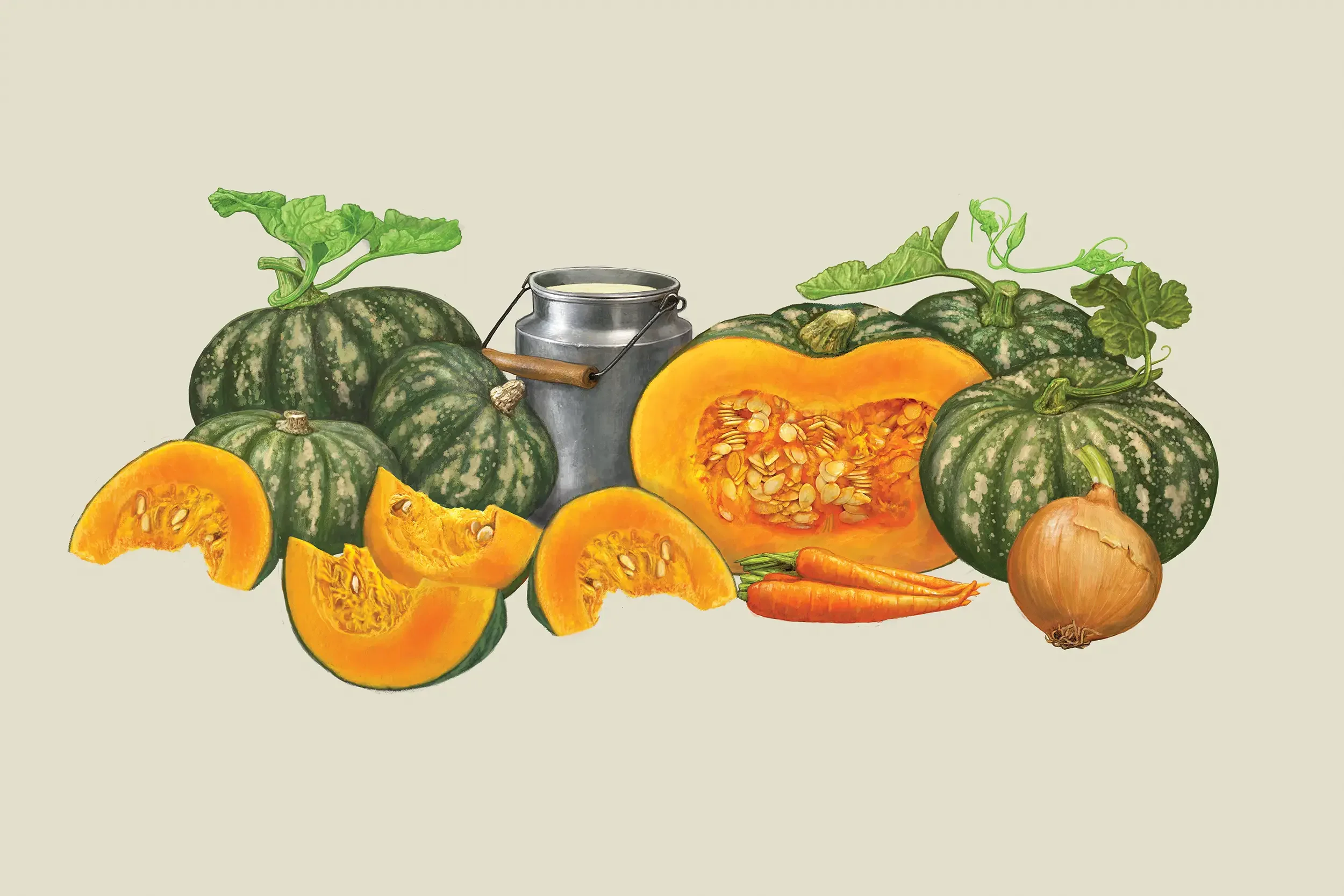
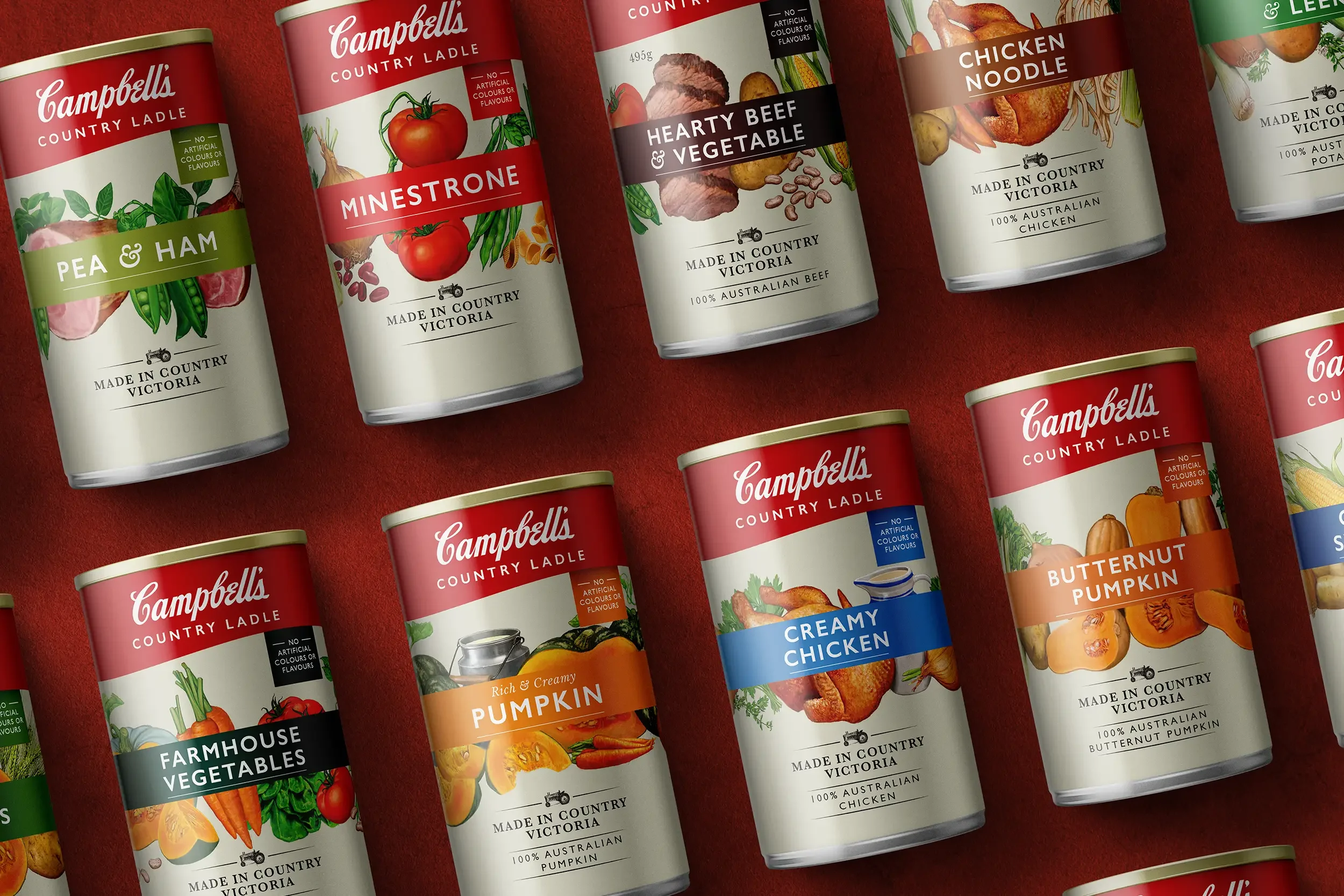
The redesign brought strategic clarity and crafted storytelling to the forefront. We began by anchoring the brand in its roots — drawing on the idea of simple, wholesome food made from the land. The new visual identity introduces hand-illustrated ingredients for each flavour, bursting with raw texture and artisanal detail to evoke freshness, quality, and care.
A bold colour-coded system simplifies navigation across the range, giving each variant stronger shelf presence and aiding quick, confident choice. Typography and layout were restructured to bring the product’s flavour story forward — making smoky beef feel robust, lentil feel hearty, and every can speak directly to the taste within.
This was more than a visual uplift. It was a portfolio harmonisation project, strategically realigning Country Ladle under a unified brand architecture. The result is a modern, flavour-led system that reasserts Campbell’s as a trusted name in everyday nourishment — honest, inviting, and made to be shared.