
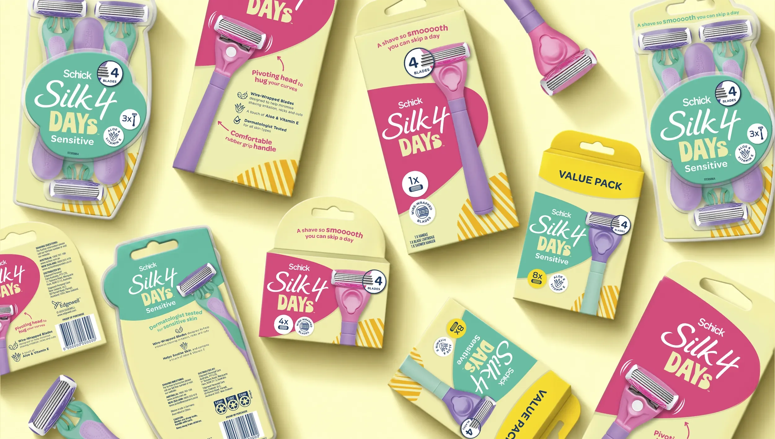
Life in full colour
*
Life in full colour *
SCHICK SILK 4 DAYS
Brand Naming
Identity
Packaging Design
Brand Application
The shaving category has spent decades telling women what a razor can do. Schick Silk 4 Days captures what it feels like to be ready for the day ahead. A new name, a new identity, and a brand built to live far beyond the shelf.
Challenge.
Schick's Silk 4 was a well-performing razor with a credible four-blade platform. What it lacked was a brand that could speak to a younger generation of women who were choosing products based on personality, not just performance claims.
Edgewell needed a compelling, differentiated offer for Coles. The brief asked for something more fun, more colourful, more contemporary — and proposed two names to explore: Silk 4 Glow and Silk 4 SmoothGlide.
Both names described the product. Neither described the range it needed to become.
Strategy.
The most successful brands in this consumer's world weren't winning with just product claims, they were winning with character. They felt like brands that understood her life, not just her grooming habits.
The platform already had something worth keeping: the "4" referenced the four-blade system. Rather than discard that equity, the strategy was to reframe it — and to find a name that felt less like a product descriptor and more like something a person would actually say.
Silk 4 Days. It kept the architecture intact while introducing a personality the other options couldn't. Colloquial. Confident. Layered — smooth skin for days, optimism for the days ahead, and the implicit promise that this brand belongs in your life, not just your bathroom cabinet.
The strategic platform: we're not selling a razor. We're selling the confidence that comes with feeling ready.
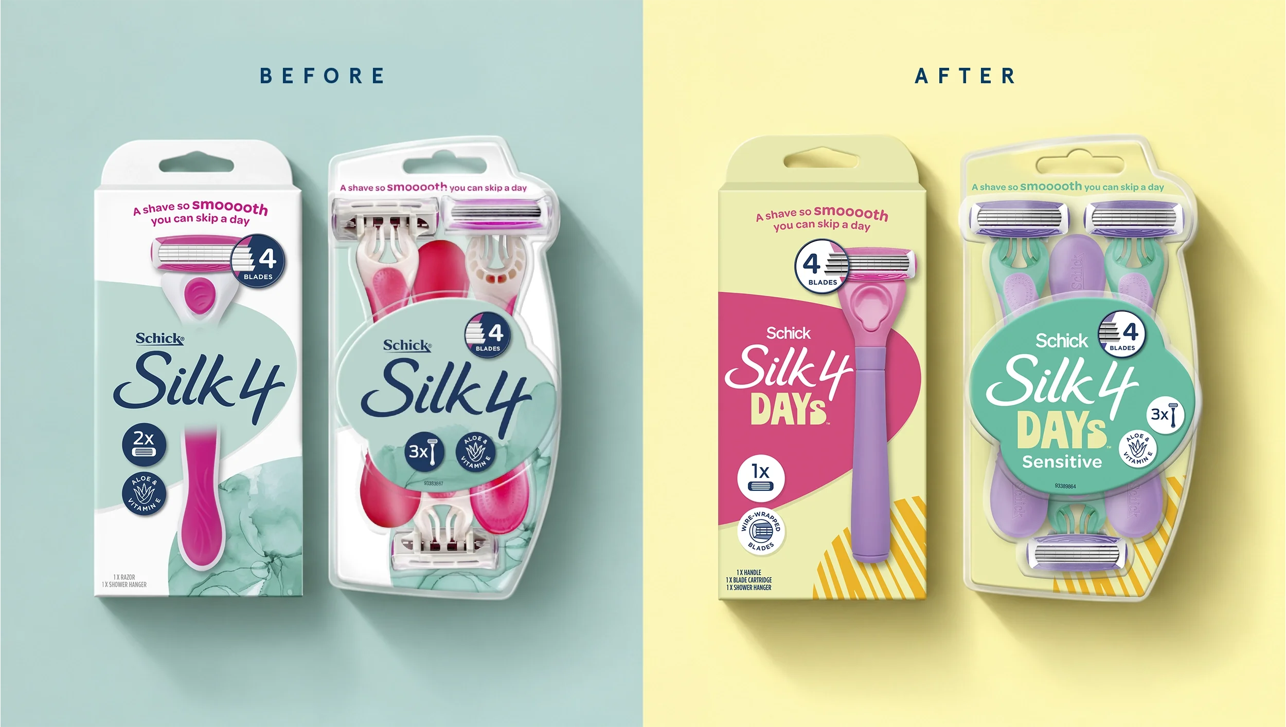
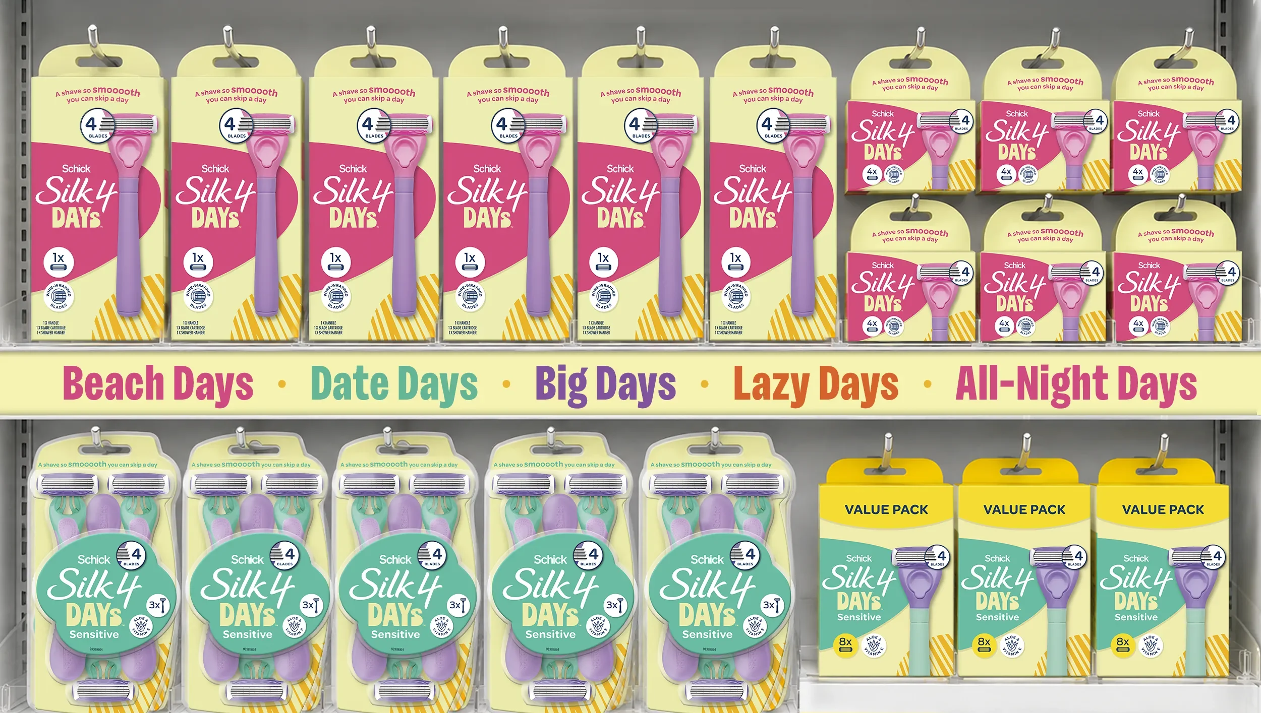
The Identity
The visual identity was built to match the name's energy — and to do something the rest of the shelf simply wasn't doing.
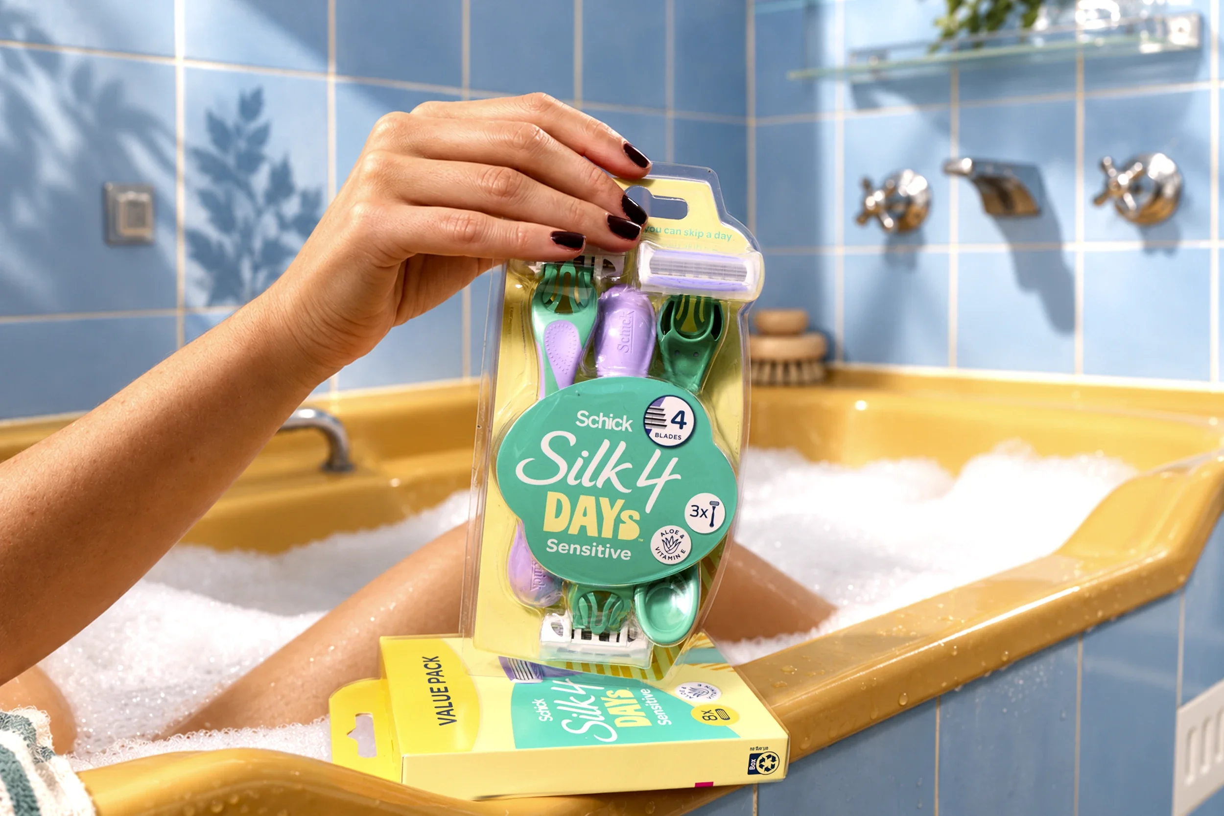
Days buttery yellow forms the chromatic backbone. Warm, sun-charged and optimistic, it creates an immediate block of colour on shelf that cuts through a category built on muted colour and clinical whites.
The wordmark balances two distinct personalities held in deliberate tension. The inherited Silk 4 script is fluid and feminine, whilst DAYs was designed to bring contrast: bold, condensed and full of character. Its compact proportions give the new name enough presence to hold its own alongside the script, while its subtly playful forms keep the lockup feeling youthful rather than rigid.
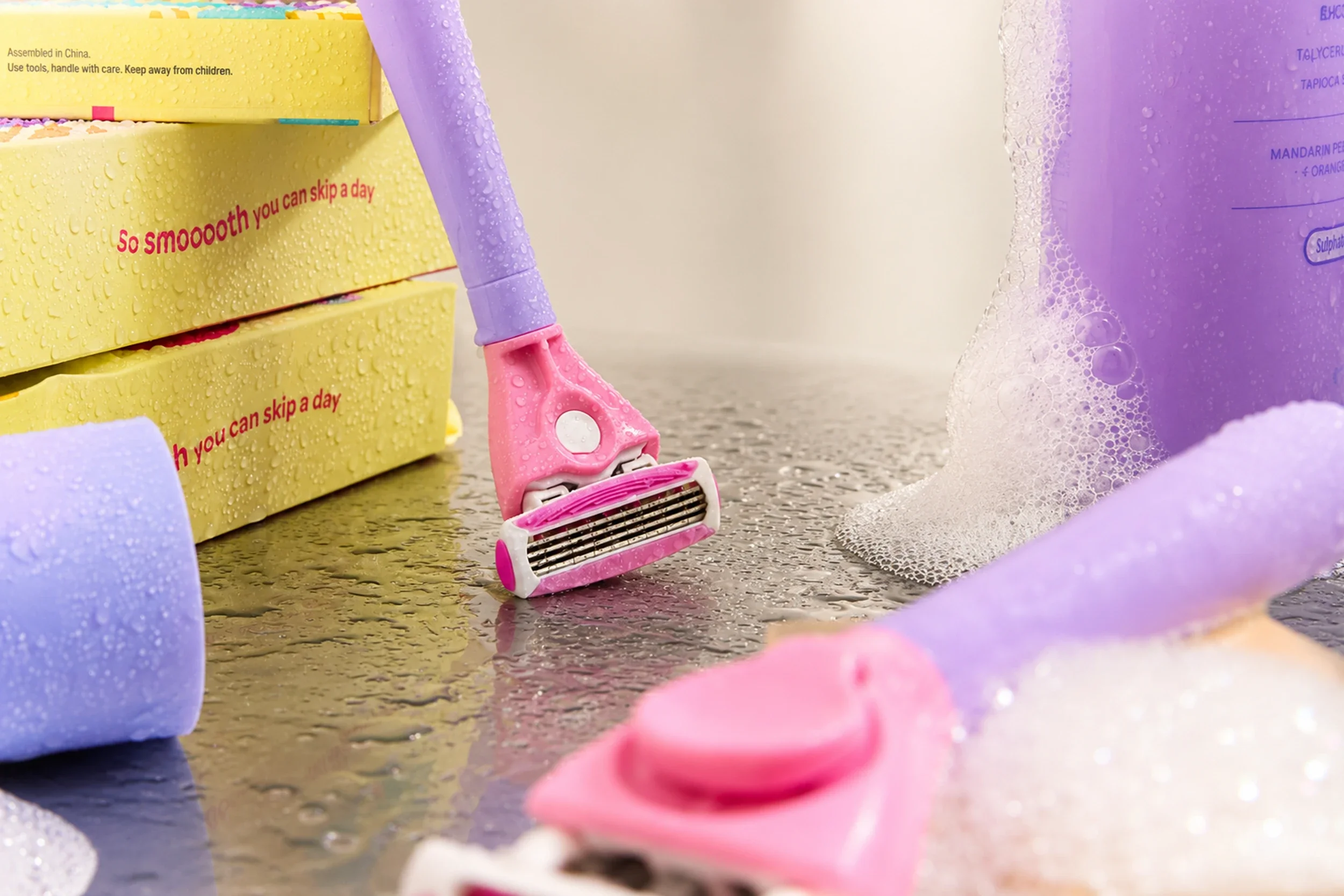
Handle colour was a considered design decision, not an afterthought. Working directly with the Schick team, the handle palette was chosen to resonate with the target consumer and reinforce the brand's personality at every touchpoint — including on the pack itself, where the handles were photographed as part of the packaging artwork.
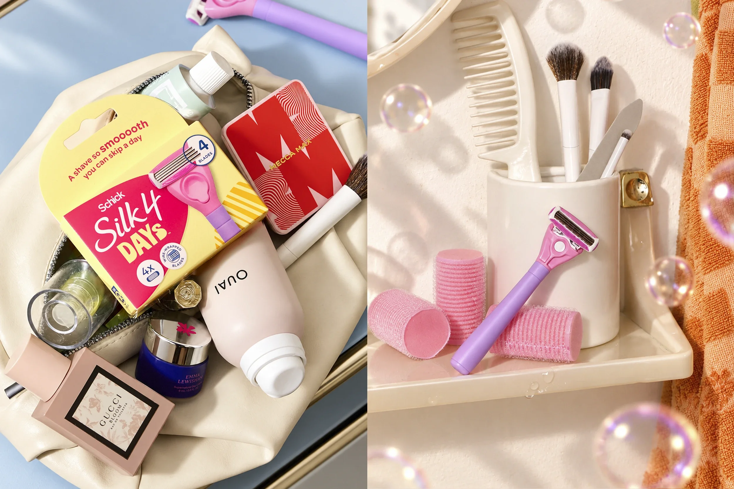
The result is a range where every element — type, colour, handle, photography — is pulling in the same direction. Not just a pack that stands out, but a brand that holds together.
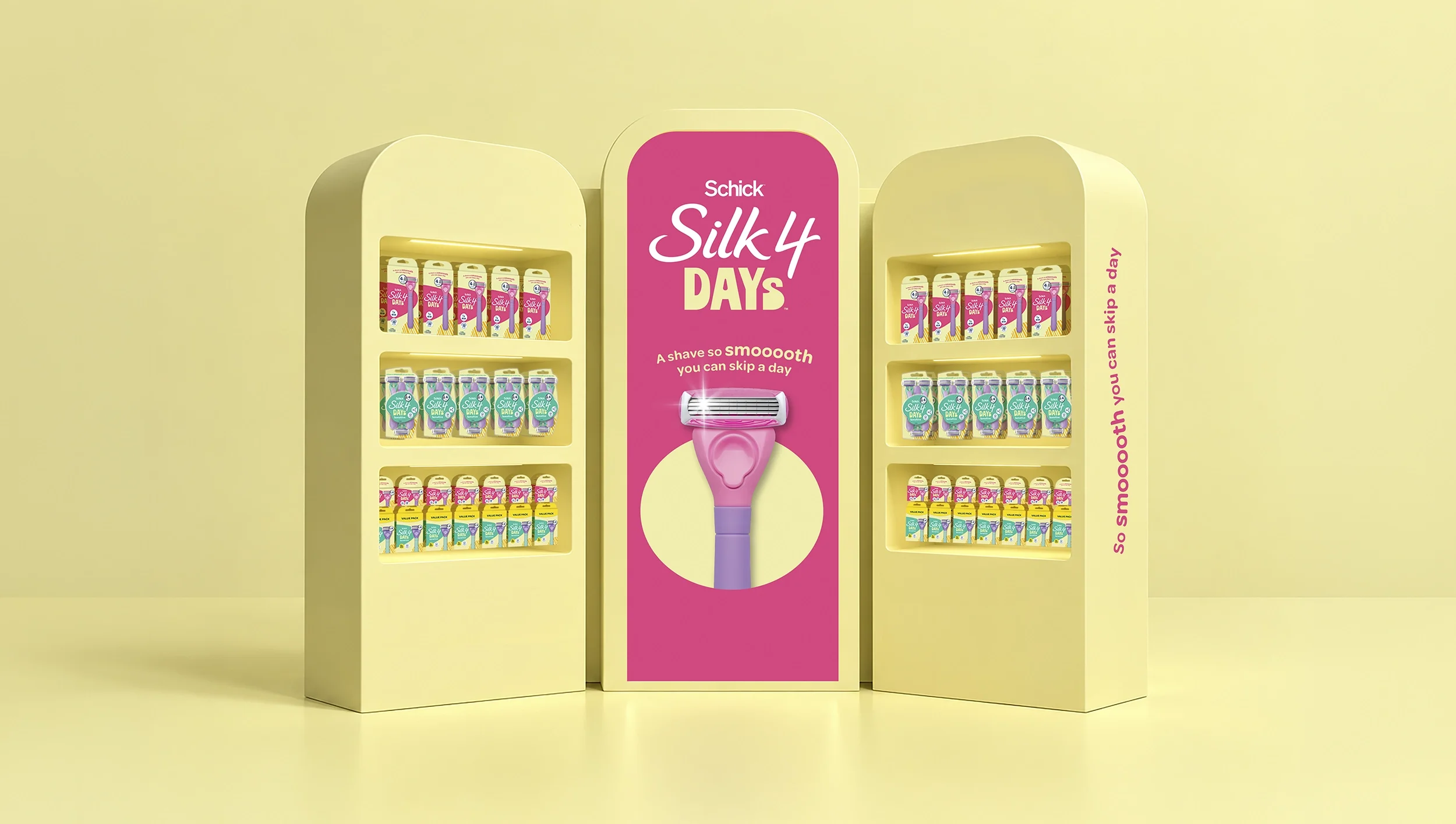
The Brand World
The pack is where the brand starts.
Not where it ends.
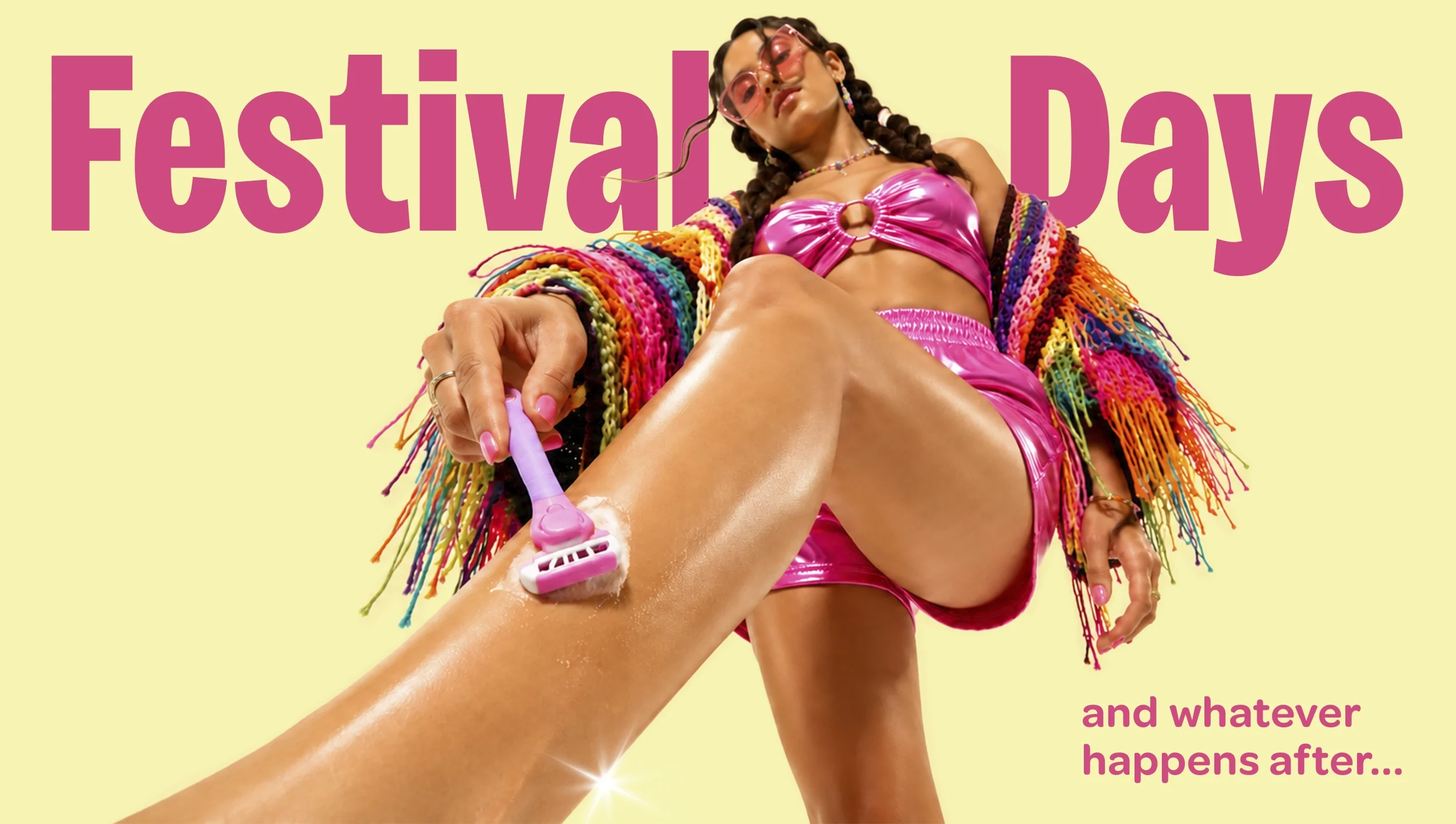
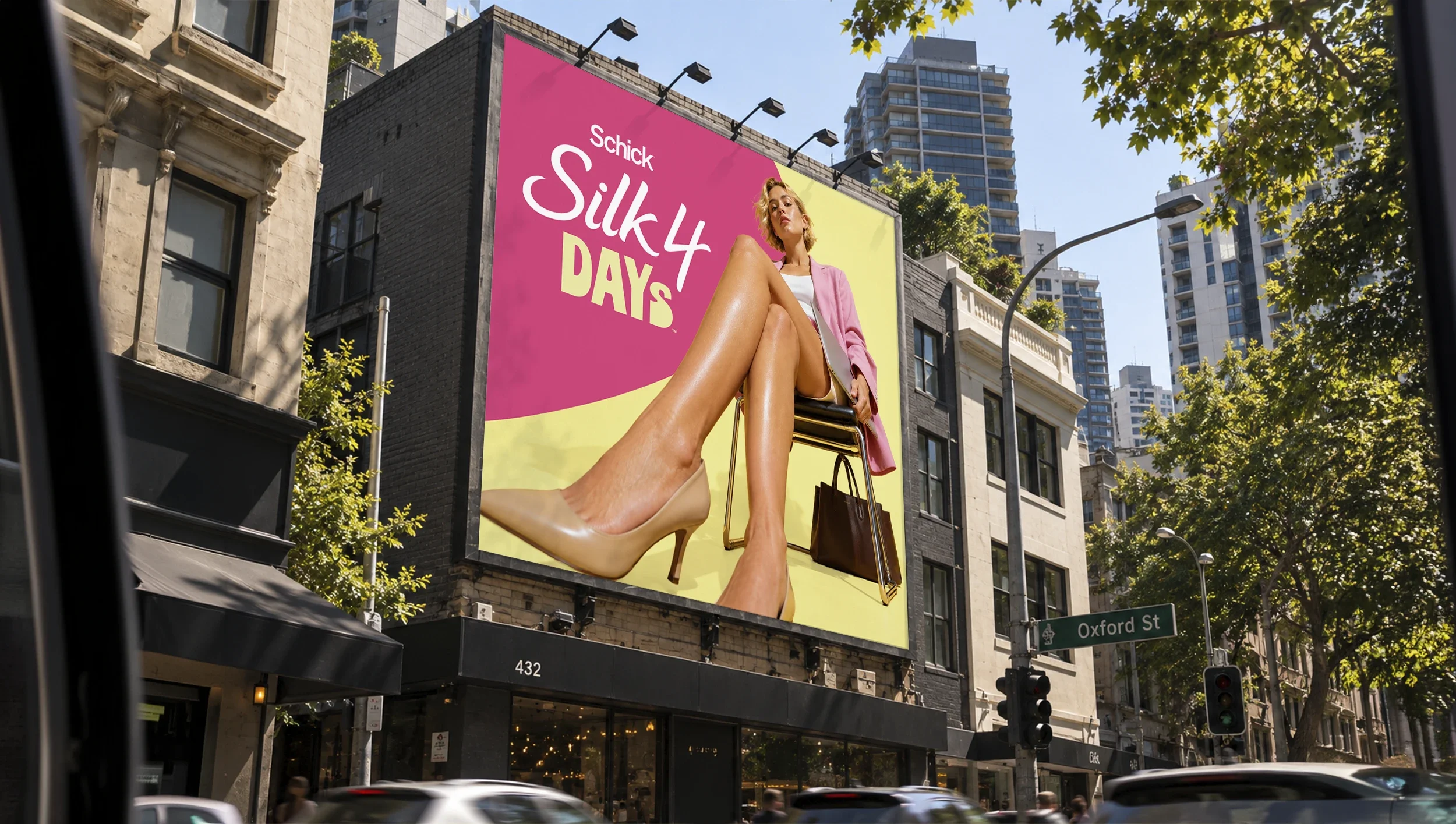
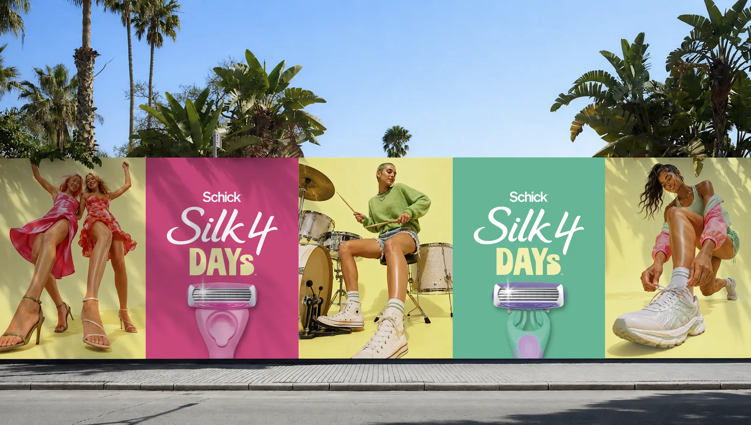
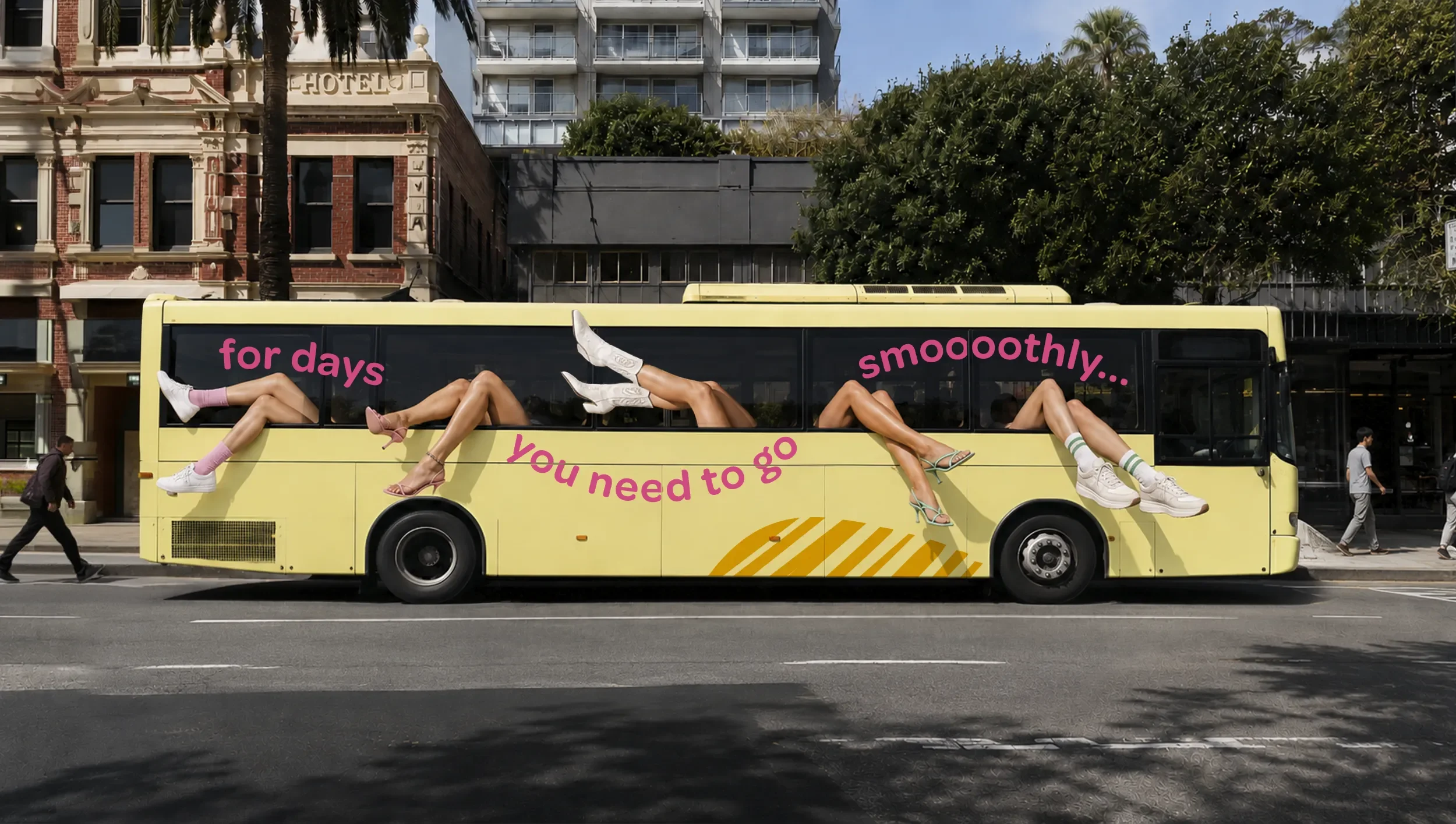
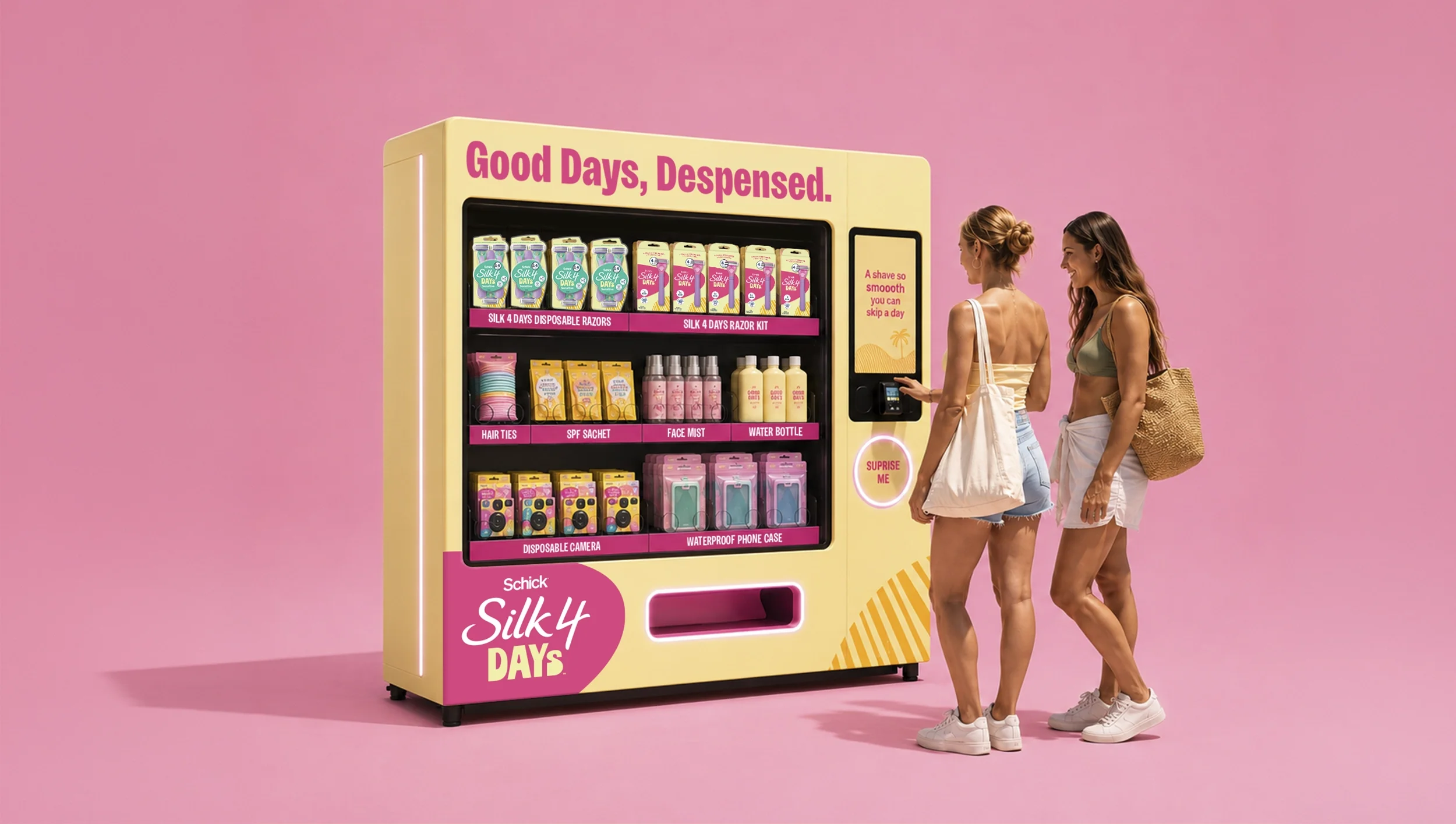
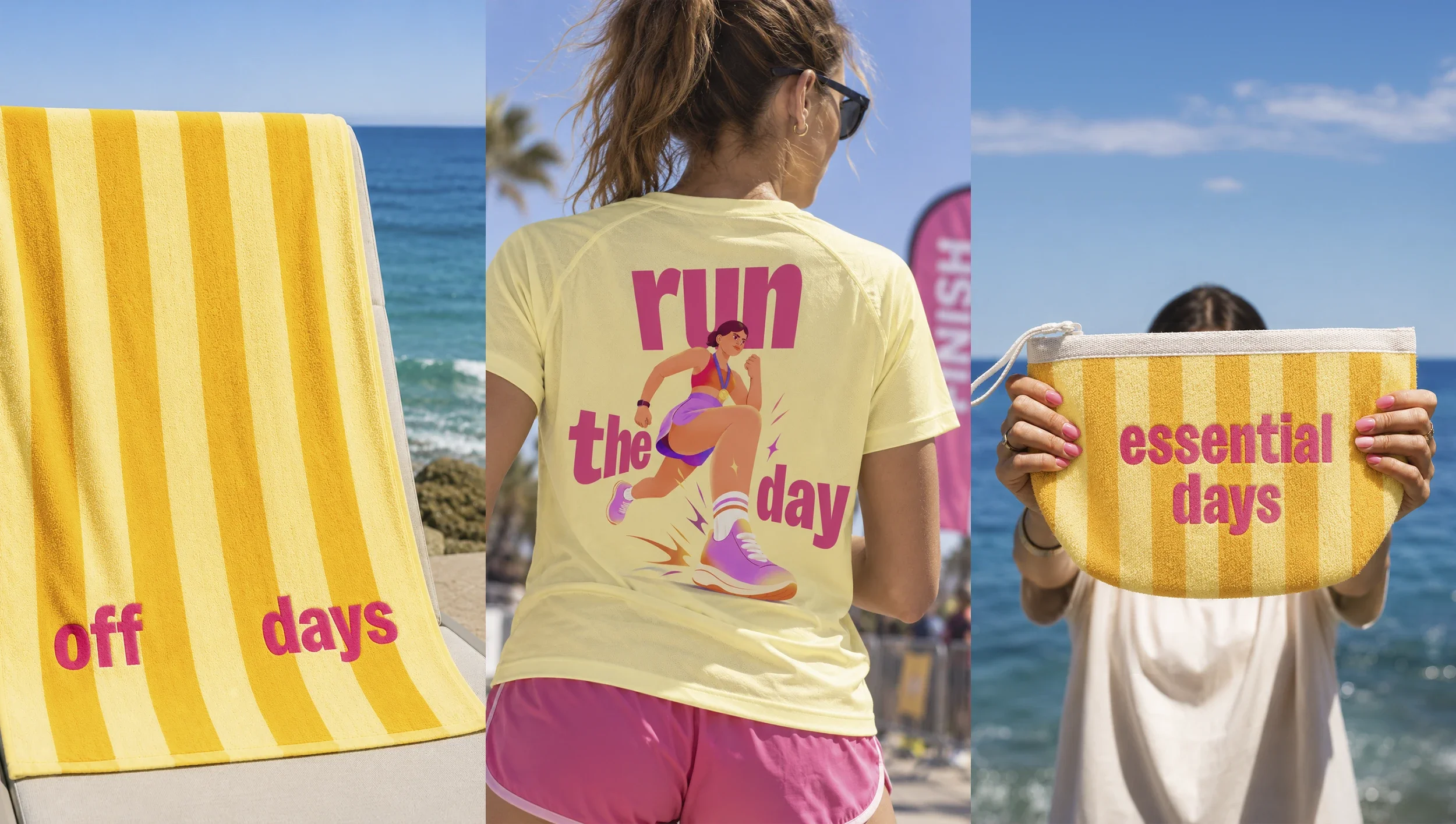
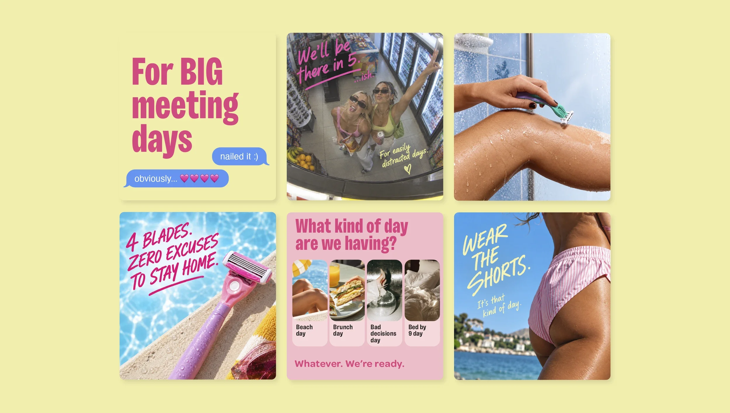
The Schick's Silk 4 Days identity was built with a world in mind. The palette, the voice, and the visual system were designed to travel — to show up consistently across out-of-home, retail activation, branded merchandise and experiential concepts.
Out-of-home concepts use the yellow field, no product photography needed — the colour makes the argument. The bold typographic voice and the brand's instinctive optimism translate to every surface without losing anything.
This is not decorative thinking. It demonstrates that a brand built with this much intentionality at the packaging stage can activate coherently at every consumer touchpoint — without starting again from scratch each time.
A name that wasn't in the brief. Now on shelves.
The Schick's Silk 4 Days range is live in Australian retail. The restaged range launched at Coles in 2026. What started as a brief with two functional name options became a brand with a name, a world, a voice, and the kind of shelf presence that makes you pick it up before you've consciously decided to.
The project is proof that the most consequential creative decisions are often strategic ones made before the design begins — and that a client willing to push past the brief is the kind of client you can build something genuinely memorable with.