shaped by the land
*
shaped by the land *
EVER FLOW
Brand Naming
Brand Narrative
Brand Identity
Verbal Identity
Packaging Design
Created at Our Revolution
How It Started.
The brief was to create a wine brand that could unite a portfolio sourced from Victoria’s renowned Yarra Valley — a cool-climate region celebrated for blends that are both approachable and complex. With a $20–$30 price point, the identity needed to balance mid-tier accessibility with more premium cues, appealing to both casual buyers and more discerning wine drinkers.
With little backstory on the liquid itself, we turned to the region for inspiration. The Murray River — the lifeblood of south-eastern Australia — winds through the Yarra landscape, shaping its terroir and sustaining its vineyards. Known to the Wurundjeri people as Birrarung, meaning “ever flowing,” it became the brand’s central symbol — a timeless connection to heritage, place, and the enduring quality of the wine.
What We Did About It.
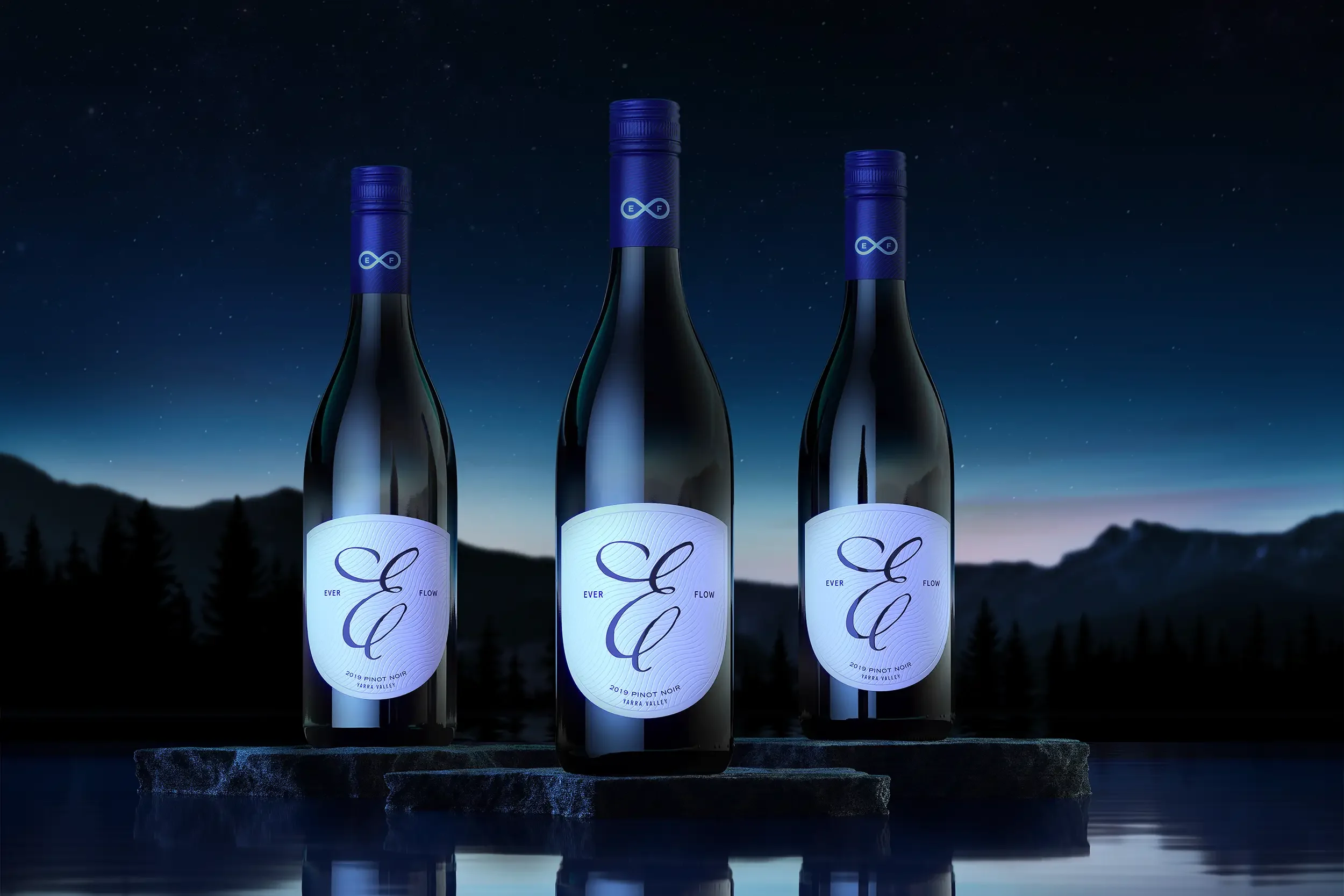
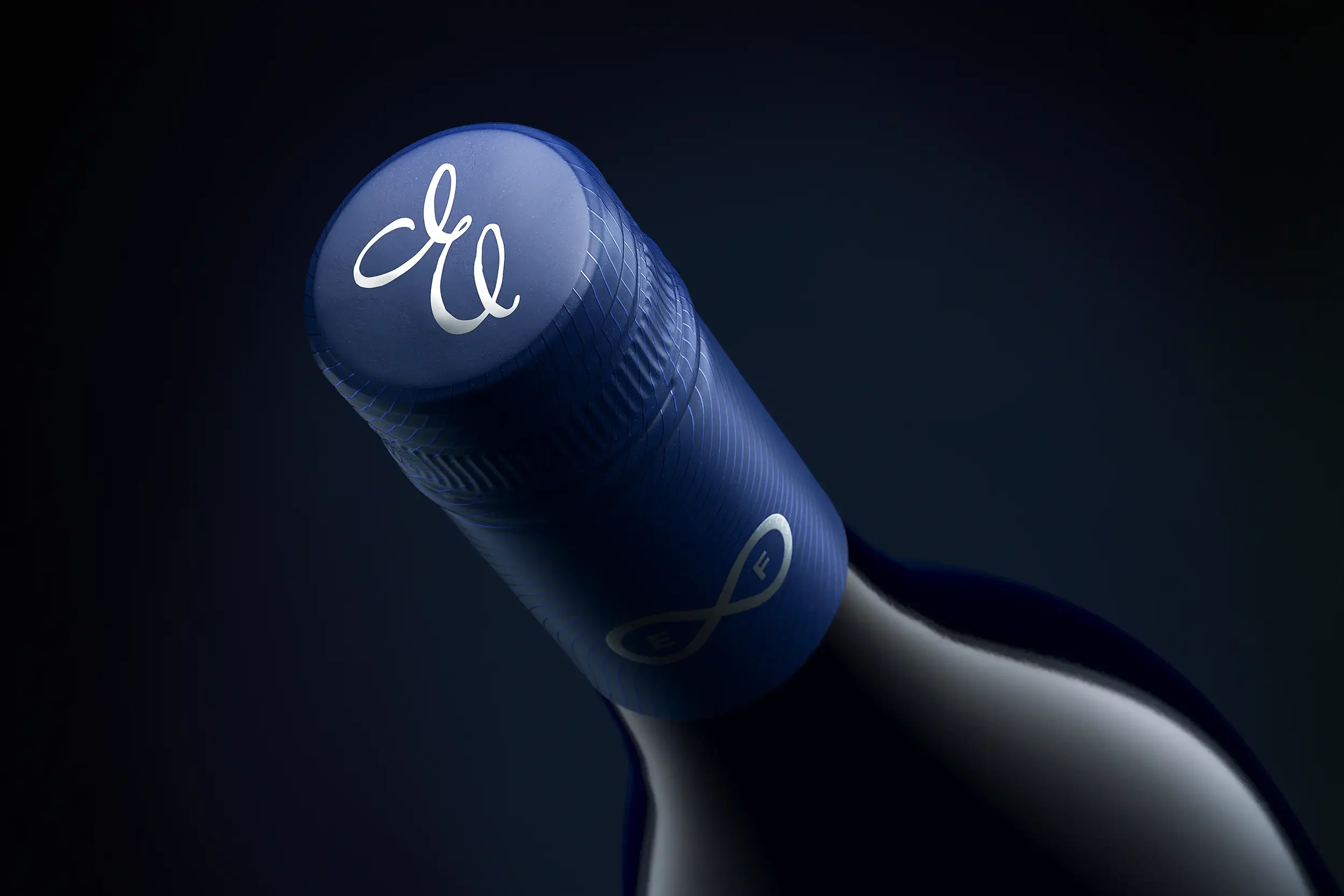
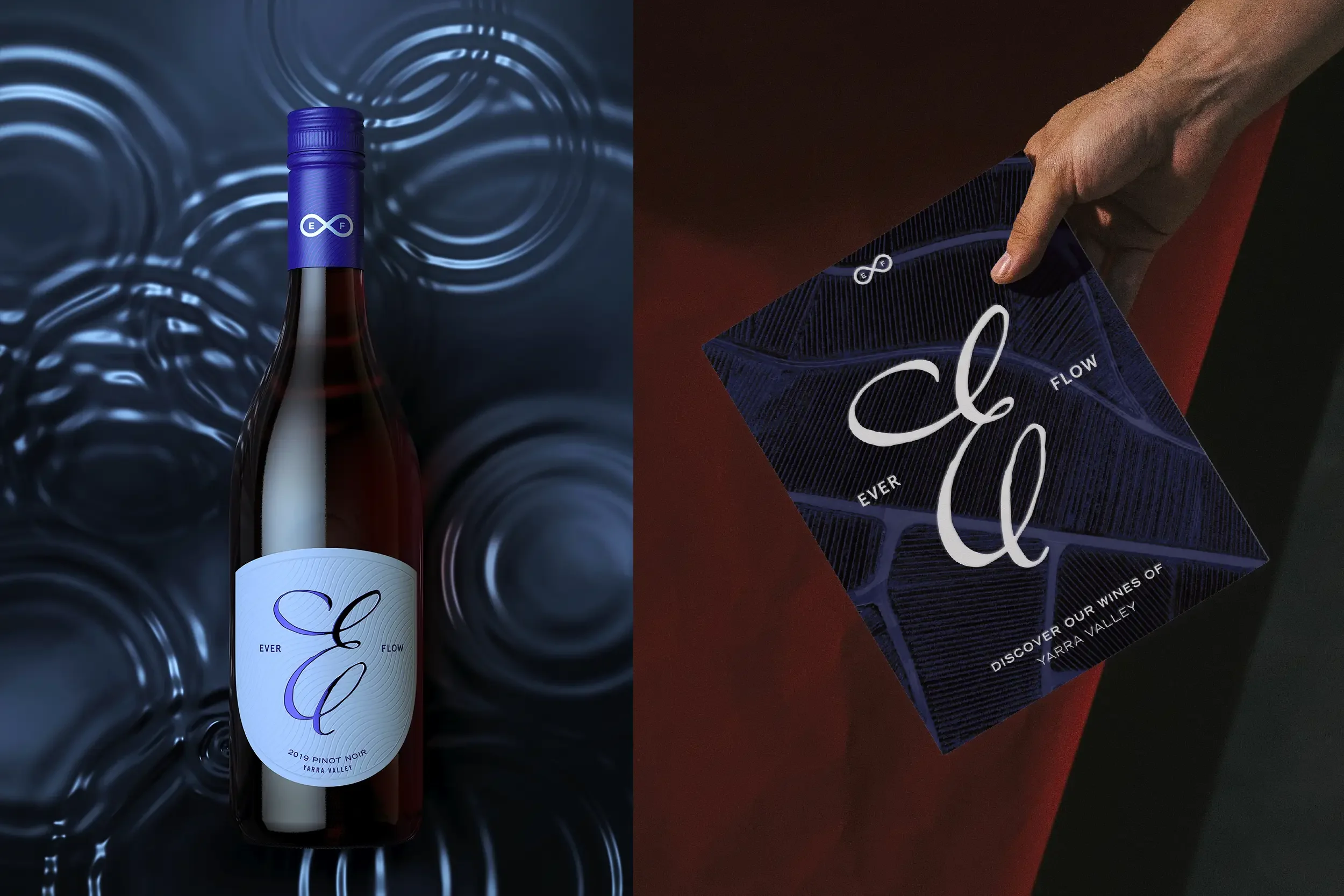
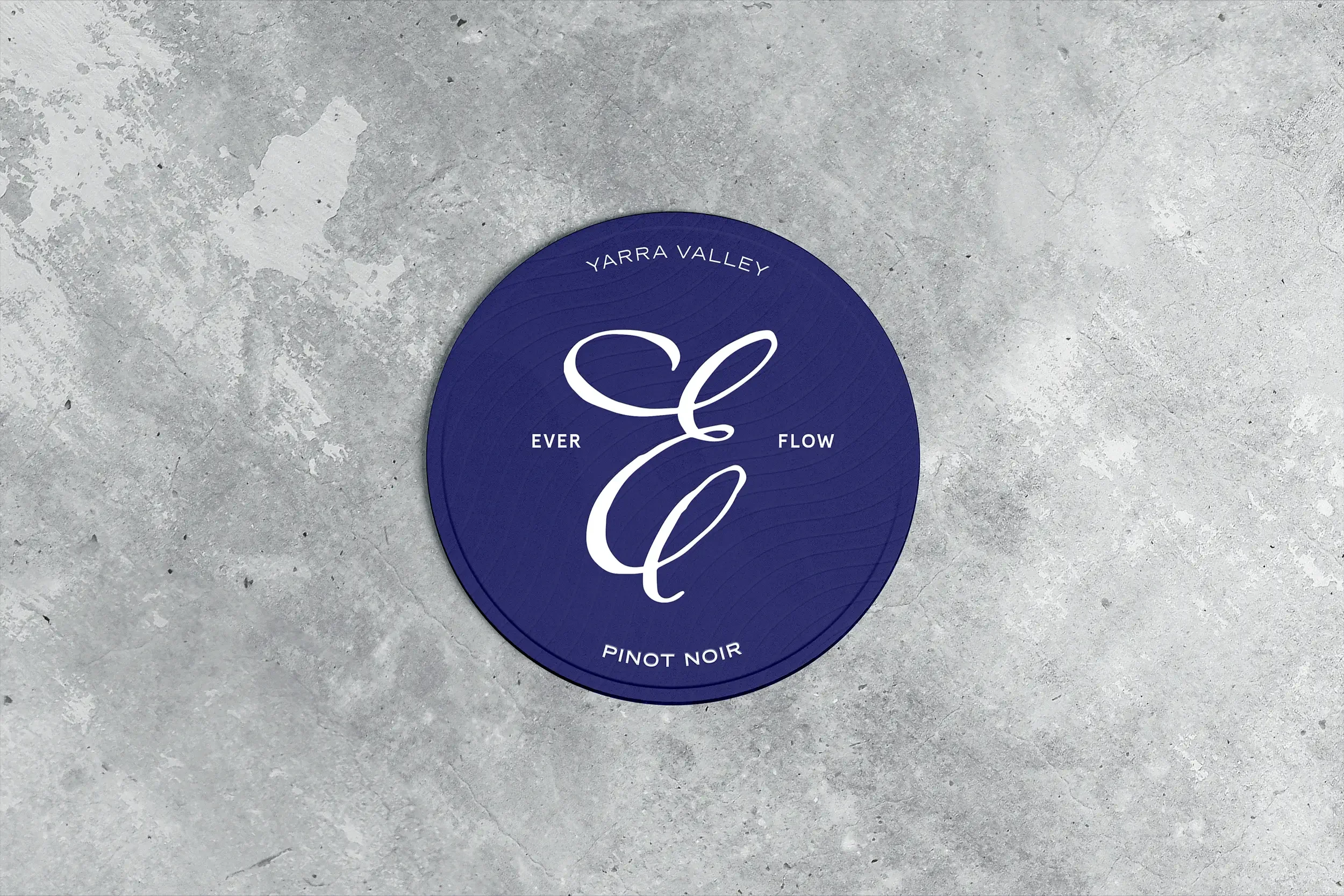
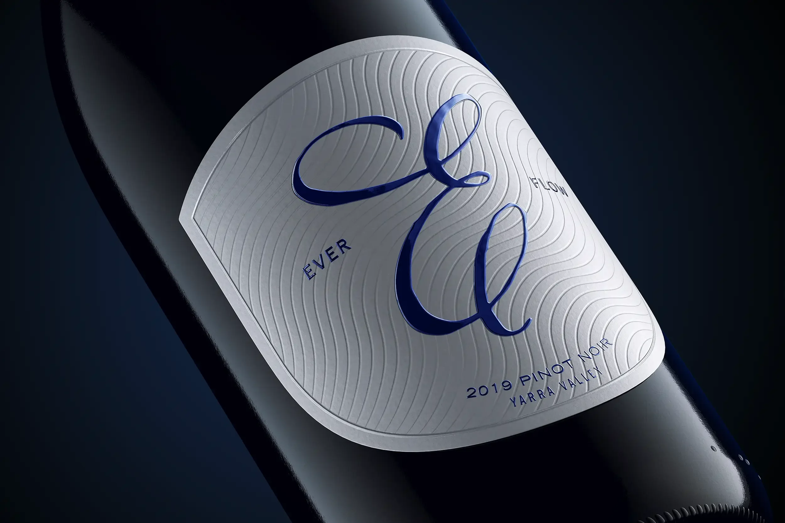
The name Ever Flow pays homage to this continuous, life-giving river, and the brand identity builds upon its story. A custom-crafted initial ‘E’ — inspired by the winding path of the Murray — was hand-drawn by a calligraphy historian, preserving the subtle imperfections and character of traditional quill work. Embossed and varnished, it shimmers like water in the light.
The label takes the form of a contemporary shield, detailed with intricate linework that echoes the patterns and movement of flowing water. On the cap, an infinity symbol reinforces the brand’s promise of enduring enjoyment. The combination of regional authenticity, timeless craft, and modern design cues positions Ever Flow as a sophisticated yet inviting wine, rooted in place but ready to stand proudly on shelves for years to come.
